Reflection: The Infographics

At the end of this project, I can safely say that I am very please with my Infographic. The idea for this however, was pretty instantaneous. Even though several of my peers and I had the same idea, I decided to stick with it, as I felt I could still produce something that really stood out.


My personal favourite part of the designs are the house style; I like the slightly messy look to it and feel it fits the overall blackboard theme I was aiming for. The final look does not look too messy either; just the right amount – to the point where it looks a little messy, but it is still easily eligible and not too stressing on the eyes.


If I had more time, I would probably work on trying to get the animations to work. As you will see in previous posts, I spoke extensively about animations and various other effects that could bring the graphics to life. However, I had to focus on the design, and not the animations.


I loved the idea, however, the research was very hard. As the idea came to me really quickly and I had a good, strong vision of what I wanted, I felt that there wasn’t much research to be done. I couldn’t think of a way to really change it until I saw a final design. I tried doing a few things before hand, but there wasn’t enough that I felt I could call a decent amount of research.


In conclusion, I am very pleased with the design. Although I could not do as much research as I had hoped, I am not going to fret too much about this; at the end of the day, it is the final design that is important – not how I got there. I had never really thought about producing Infographics before but have come to really enjoy this project and would certainly not mind doing it again. As long as I am given all the information I need at the start and don’t have to research the subject myself.


– Luke Halstead
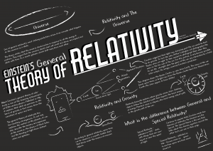
The Final Design: A2 and Desktop Versions

The A2 Version

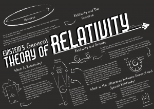
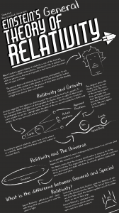
The A2 was the first version of the infographic I made. I did this as it seemed like the easiest and would be a good starting point for the others.

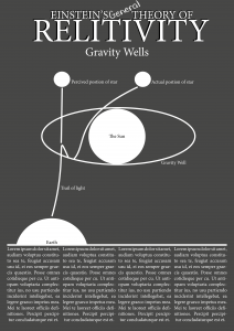
Below a design I came up for the A2 version of the infographic:

Luke Halstead A2

This version is what I came up with after all of my research. This is the version I showed at my presentation and ended up basing all the other sizes on.

Luke Halstead A22

This is the final design for the A2 version. After the presentation and receiving some feedback from my peers, I decided to review and redesign the the infographic a bit; the main thing I did was rearrange the text, so that the boarders between each section of the poster was more obvious.

The Desktop Version

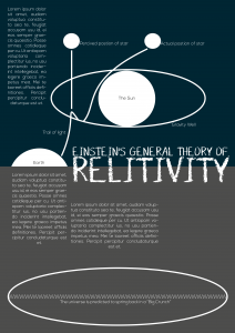
Below is the first incarnation of the desktop version of my infographic:

Infographic PC Screen

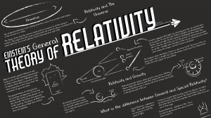
Just like the phone version, this is simply the A2 version resized and rearranged. Although I was initially happy with this, I decided to redesign after realising how satisfied I was after re designing the phone version.

Desktop Based Infographic Luke Halstead2 Desktop Based Infographic Luke Halstead3 Desktop Based Infographic Luke Halstead4 Desktop Based Infographic Luke Halstead5 Desktop Based Infographic Luke Halstead6 Desktop Based Infographic Luke Halstead7

This is the final design for the desktop version. This is what I came up with based on what I saw and feedback from my peers. Following on from the A2 and mobile versions, the desktop version follows the same style of text and diagrams, as well as containing the same information (although it can hold more, shown by where I’ve used the Lorem Ipsum) all menu items – when the cursor is place over the icon – will display the name of the destination page, as well as slightly enlarging the icon. All menu icons are diagrams taken from the destination page. The “Einstein’s Theory of General Relativity” icon will take the user back to the homepage. Just like with the phone version, each page will focus on a particular subject. The home page is very simple; just the logo in the middle, with the menu items underneath. The user interacts with them in the exact same way as stated before. This page has an extra option on it though; a page that gives credit to those who developed the page, as well as the sources of information. Just like with the phone, I added some “board markings” to make the background a bit more interesting and more like an actual blackboard.

The Final Design: The Phone Version

After developing the A2 version, I moved onto the phone version. Here is what I came up with:

Luke Halstead Phone

In this version, I had simply rearranged the A2 version, and had made the text smaller to fit the size. Although I was happy with it, after the presentation and seeing my peer’s design, I decided to do a complete overhaul of the design. This is what I came up with:

Luke Halstead Phone2 Luke Halstead Phone3 Luke Halstead Phone4 Luke Halstead Phone5 Luke Halstead Phone6 Luke Halstead Phone7

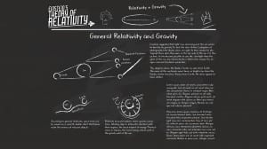
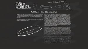
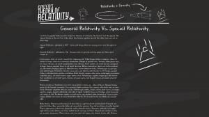
This is my final design for the phone version. One of the big criticisms of the infographic was the size of the text, so I decided to rather than cram it on one page, I decided to make it interactive. I will talk about each page in the order above.

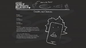
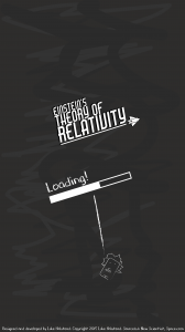
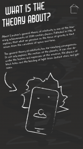
The first page is a loading page. As it loads, I plan to have the logo grow and shrink like it’s bouncing in and out from the background. The loading bar will also fill as it loads. This page will also contain the appropriate credits and sources at the bottom as show. I also added a textured background (that is meant to resemble rubbed out chalk on a blackboard) as I felt with this new design, the background look a bit too plain. I tried this background style with the other sizes of infographic, but this just made them look too cluttered. This page will also be used between transitions if need be and will drop down from the top and the drop off the screen.

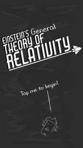
One the second page, when it is done loading, the title will grow big one last time and stay that size, maybe bobbing up and down a bit – but nothing more. The loading bar itself will the drop off screen and the word “loading” with transform into the phrase “tap me to begin!”. This bit will do the same action as the title on the previous screen. The user will then either tap the statement, the Einstein drawing or anywhere in-between to begin.

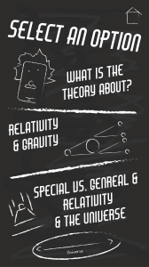
Once, tapped, the page will transition by dropping all the elements off the screen, and the elements for the contents will drop in from the top. Only the images will move on this page – so that it is not too distracting to the user. Even then, these will only do subtle bobs up and down in a small area.Once any of the contents options are tapped, it will do the same transition as between the “tap to begin” page and the contents page. There will also be a home button at the top (This will not move like the other images) – This will be on every page in the same place from now on. Once tapped on any page, it will do the same transition as between the “tap to begin” page and the contents page. The user will then be taken back to the “tap to begin” page.

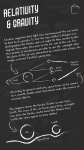
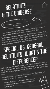
 The other pages contain the same information as the other infographic, just divided over three pages. The text on the phone version is actually larger than the text on the A2 version – as I found I actually had too much space. I also change the font of the subtitles – to the same font as the main title (Air American) – to make them stand out a bit more. I then got rid of the shadow in the background, so that they weren’t completely like the main title. As stated before, there is a home button to take the user to the “tap to begin” and the user can swipe left or right to access the different pages. There will be no animations on these pages, as it may distract the user too much from the text.

Designing The Title

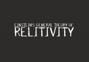
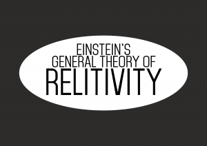
The design for the title was pretty spontaneous, but not instant. I started off by doing these two designs initially for the test infographics

Infographic Title Tests2

Infographic Title Tests3

Infographic Title Tests5


I knew after making these that these would not do for the final design; the looked very boring some looked too academic. Although the poster is designed for students at a high level, I didn’t want it to look too boring, and the title was one way to make the poster a bit more interesting and fun.

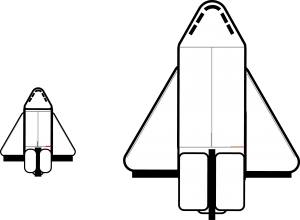
The design for the title came about after I made this space shuttle design randomly while messing about with ides for a design:

Shuttle

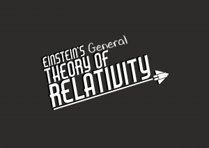
I couldn’t really find a place to incorporate the shuttle into the other aspects of the infographic, so i tried putting it into the title. With a combination of this shuttle and being inspired by older film title designs, I came up with these two designs:

Infographic Title Tests

Infographic Title Tests2

They are both fun, fit in with the idea relativity – with a kind of space aesthetic – and fit well with the colour scheme. Although often can be controversial – I like the shadow effect on this, as it adds a subtle 3D effect to the title, making it look a little more alive. This is a style of title that I think works well and I intend on putting these on my final designs.

Testing Out Potential Designs

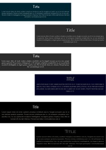
Taking inspiration from my mood boards, I decided to try out different, quick ideas for the final design. I knew that I wanted to aim the design at older students; perhaps from 18-20. This meant that the infographic would focus more on text, rather than images, to deliver the information. Here are the designs I came up with:

Poster Tests Poster Tests2

After that, I decided to look at text combinations a bit. Here are some of the combinations I came up with:

Poster Tests3

As I stated before, I knew I wanted to aim the design at students and that I wanted to give the infographic a darker and more serious aesthetic. At least, I though I did. After messing around with different font combinations – I decided to drastically change my approach. I still wanted it to be focused at the same demographic, but I decided I Wanted to make it more fun and less aesthetically boring. I decided a font based off chalk would be a good idea – it wasn’t too goofy, but at the same time, it was interesting to look at