Reflection: Corporate Identity

This project was one that I had a lot of fun with; it was something I had never done before and something that just like the children’s book, included elements that I have never really covered before.

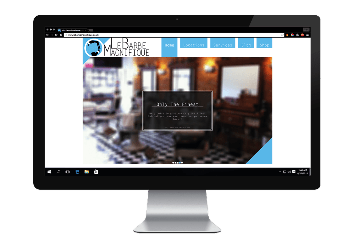
My strongest part was probably the brand guideline part; formatting the pages in an consistent manner was a lot more pleasurable for my that I assumed it would be. As someone who has a small film making brand, this whole project was extremely helpful to me to expand my knowledge of brand identity and creating a strong, consistent design.

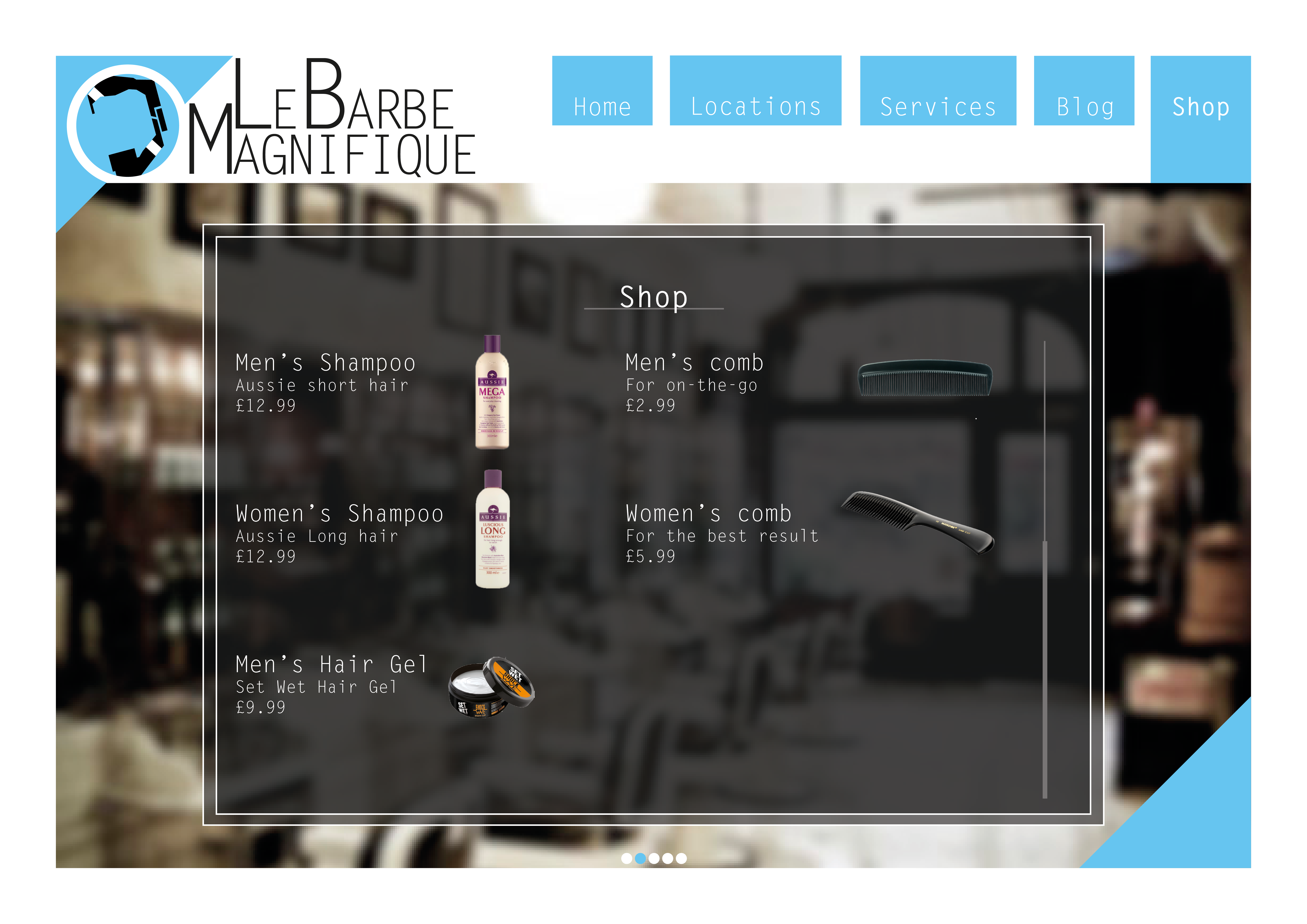
My weakest area was probably the product label designs – due to the way I had designed the website and brochure, I struggled to create a good label with easily legible text that didn’t look too squashed together. Although the designs I did end up coming up with were decent, they did not match the brand identity very well and often just looked plain awkward (especially the fragrance box). I kept trying to correct it and it eventually got to the point where I had no time to finish some of the designs (such as the fragrance bottle labels). If I had more time, I would probably have continued to experiment and hopefully get it sorted in time.

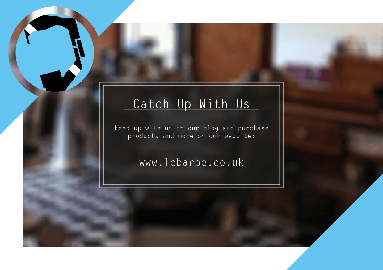
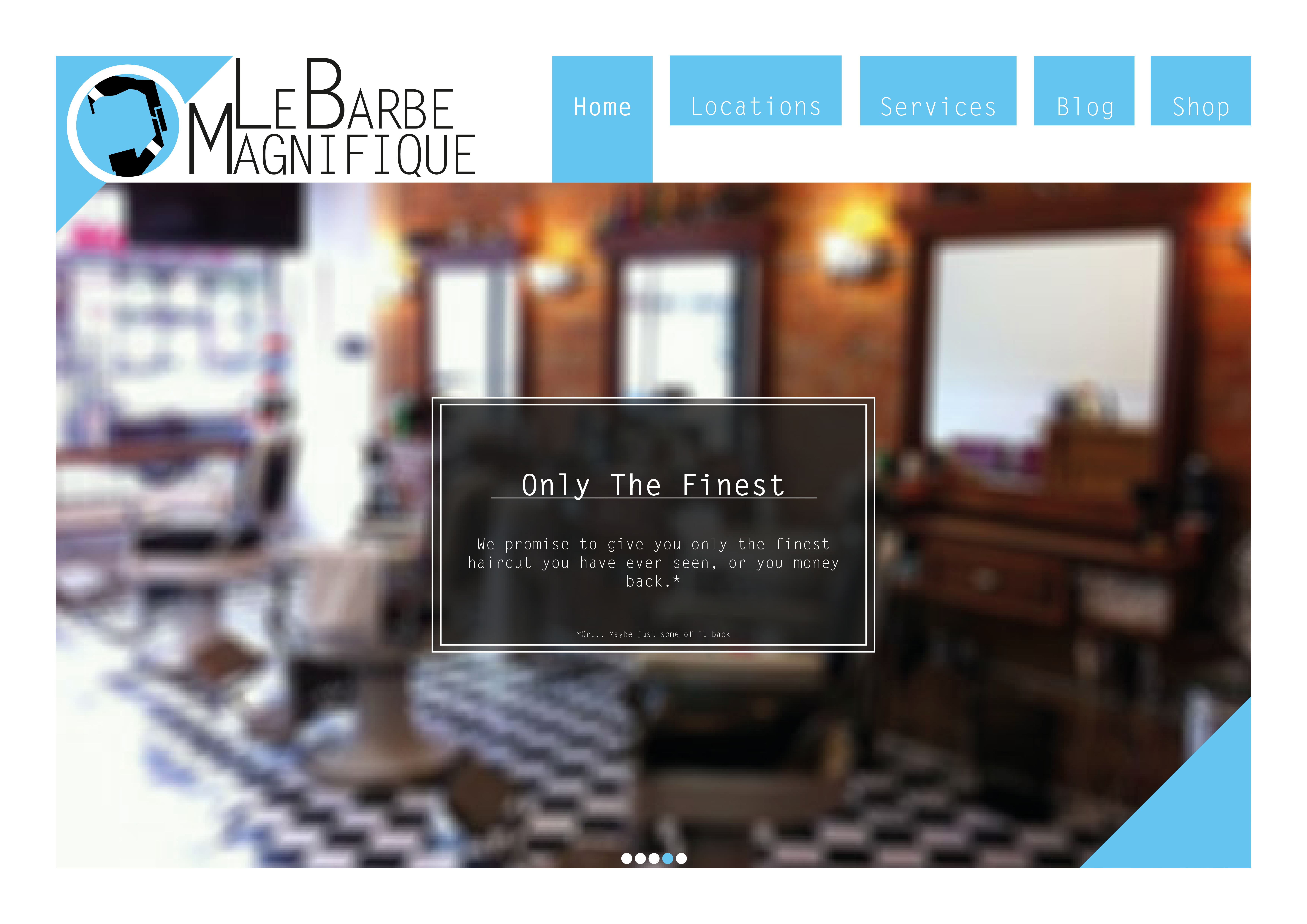
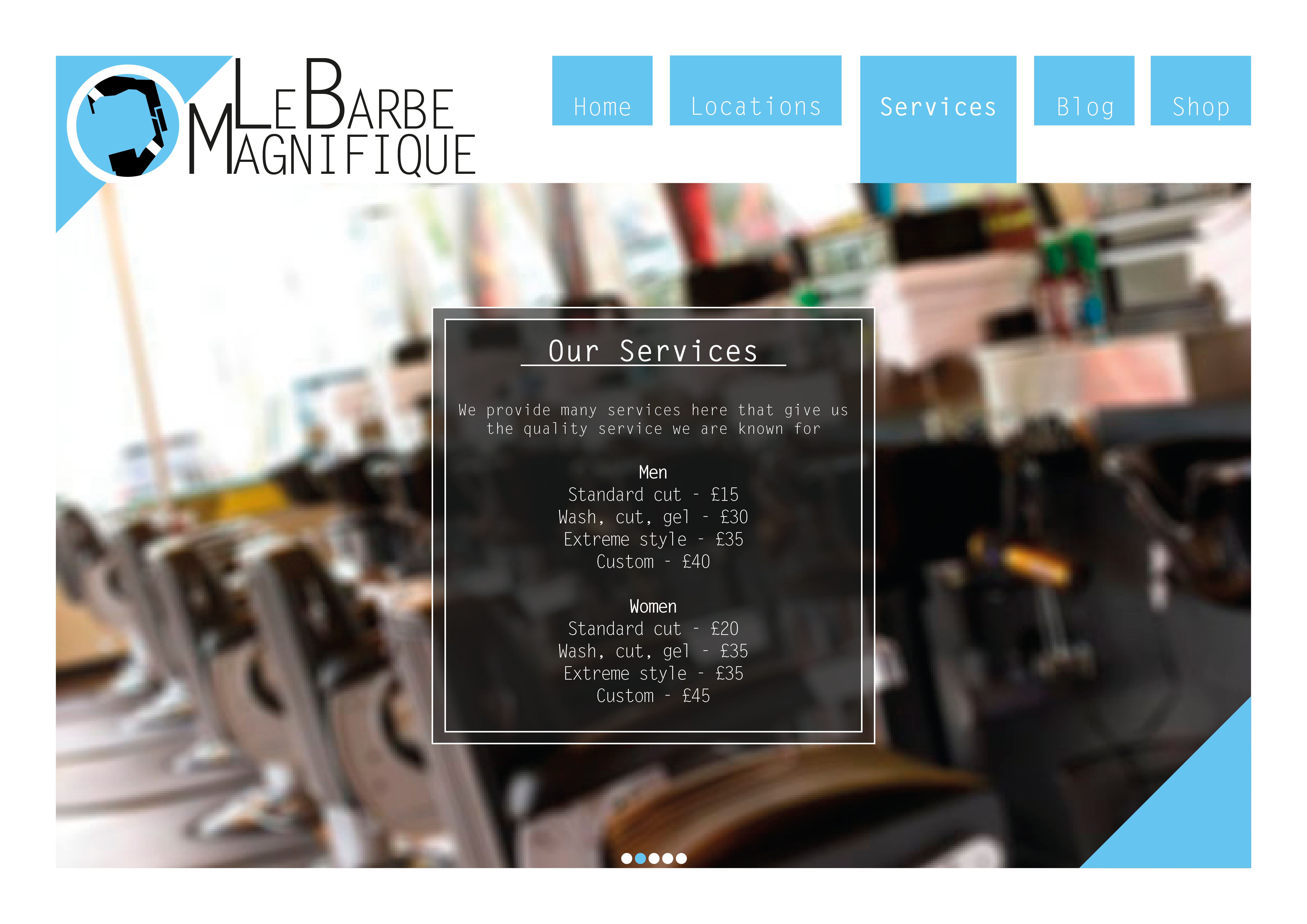
In conclusion, despite the downs, I still felt I was able to pull together a strong brand identity for Le Barbe Magnifique. I also learned a lot of new techniques which I intend on employing more of in the future (such as PSD mockups). This may have not been my strongest project over the pas year, but it is certainly one I will gladly show with pride.

Products and Stationary

Here are some products that I designed for the corporate identity. I struggled a bit with these, as the design I had come up with did not translate onto the products as well as I had hoped; the background image made it hard to work with some of the designs and I had a lot of trouble with the aftershave box (the purple one). If I had more time, I would change the house style a bit to better suit the product label designs. Here are some PSD mockups I made of some of the labels:

After Shave Box Shampoo Bottle 1

The stationary was a lot easier as a lot of it was very similar to the website and brochure designs before. If I had more time, I would probably alter the letter head a bit more, as the large blue bar at the top seems a little out of place when compared with other products. Here is a PSD mockup I made of some of the stationary.

Stationary

Brochures

These are the brochures I designed for Le Barbe Magnifique. I designed these so that they kept consistent design wise with the website. The each background image on the pages to touch at the centre (e.g. Pages on the right have the image extend to the left and pages to the left will have the background extend to the right).

Brochure Brochure2 Brochure3 Brochure4 Brochure5 Brochure6

I also kept the design of the transparent boxes for text from the website too so that there was less confusion from the potential customers when they went online looking for the site. The images in the background are temporary and would be replaced with pictures of the actual shops if this barber shop were real.

Le Barbe Magnifique Website (Desktop)

In this modern world, websites have become a very big part of companies; often being the first look at the company that people get. As Le Barbe Magnifique is being rebranded to be a modern barbers, it is only appropriate that the brand has a stylish, sleek and modern website to represent it.

This is the final desktop website design

Website

The website very closely follows the house style of Le Barbe Magnifique. The selected page is indicated by the box being extended downwards as shown on the previews. When the cursor hovers overs over an option on the menu, the selected will extend down half way rather than the full way.

Website2

 The background image is on a slideshow on a loop, showing off various interiors of the branches. Users can control it using the buttons right at the bottom. The page should always fit on the screen without the need for a scroll bar. This will be achieved by cropping and extending the background image to fit the screen size.

Website3

Website4

On pages where scrolling is needed, there will be a scroll bar available within the text element, so the user can scroll down the single text element, rather than scroll down the whole page.

Website5

Here is how the website would look in a browser:

Website with top bar

The Final Logo Design

After looking some more at the design I had, I decided that it wasn’t good enough; some people were confused as to what it was, which could have an effect on business if employed. I decided to start from scratch again. Below is a timeline of how I got to the final design.

Logo Progress 2

Numbered 1-12, this is the progress of the logo – 1 being the first design and 12 being the final. I wanted the logo to have a modern, isometric style to the way it was drawn. I chose the design to be in a circle, to give it a warm, friendly feel. At one point,I chose a square to show strength and stability, however, I decided that this wasn’t very relevant to a barbers and I instead used the circle. I swapped to blue and black from brown for two main reasons: to reinforce the friendly feel – and that these two colours helped add to the more modern look and feel I was looking for. The white streak on the beard makes it look brand new.

Logo

Here is the final logo, combined with the logo text. The positioning of each of these two elements in relation to each other may vary – depending on where the logo is being used.