Reflection: Font Design

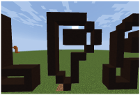
In all honesty, this hasn’t been the most inspiring of projects for me; it is very hard for me to really get my creative juices going when there are such huge limitations such as the fact that the shapes already exist. Despite this however, I have managed to produce a font that I am very proud of.


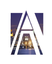
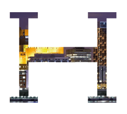
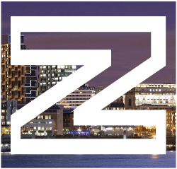
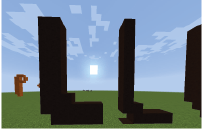
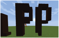
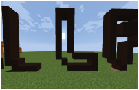
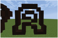
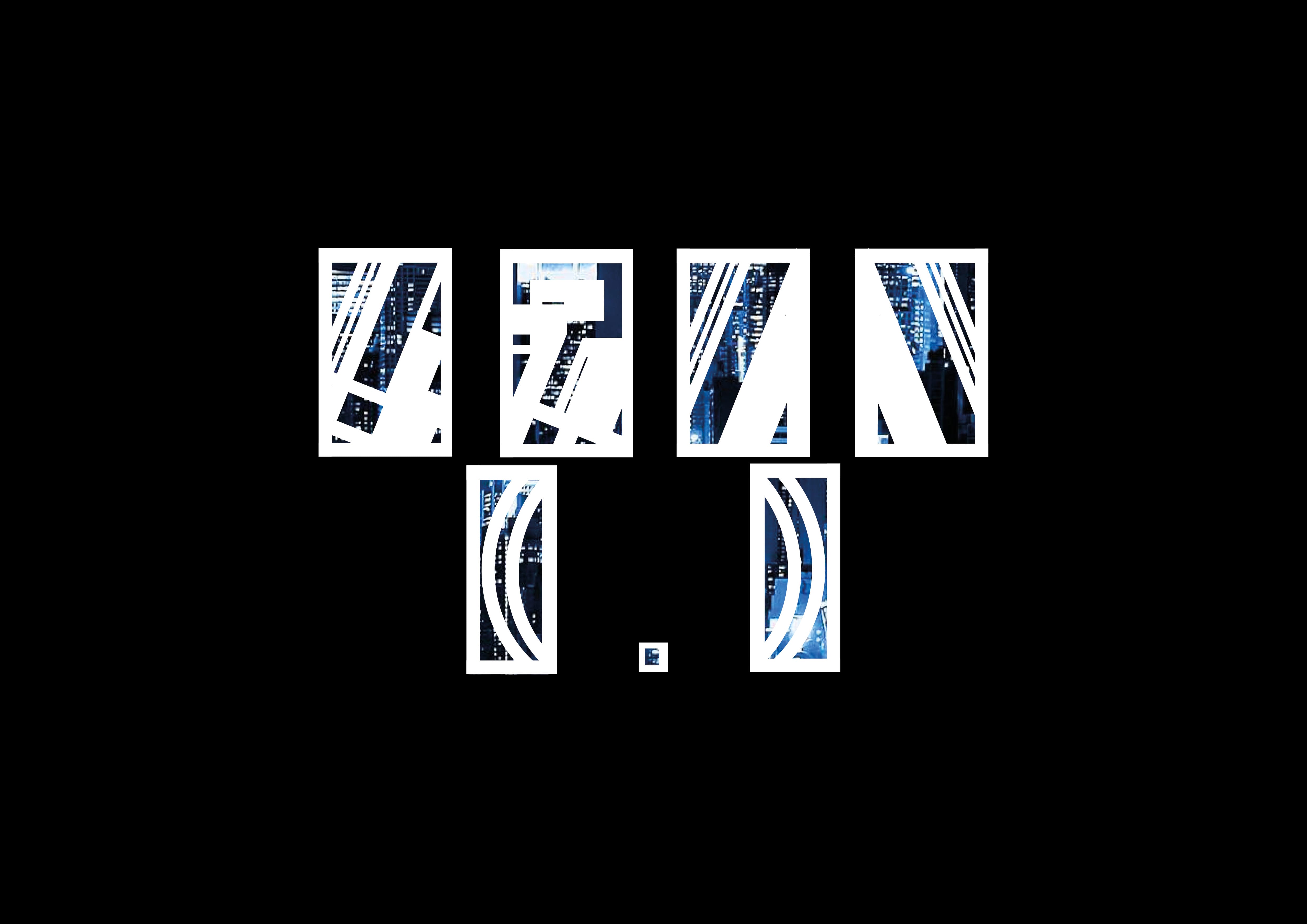
It was a tough font to do examples for; although I loved the end product, I found myself staring blackly at the screen a lot of the time, trying to come up with where I could use the font. Although I did come up with ideas in the end, I feel as though I should really have started to think about them back when I had a basic idea of how the font was going to look. Having said that, the font fits very well into the examples I did come up with and I feel that they would do very well in a sort of artsy type demographic.


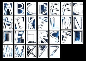
If I had more time, I would probably work more on the punctuation and examples. Given enough time, I would have enjoyed creating a fully functional font – not just with punctuation, but also special characters, such as “ê” and “ü”.


In conclusion, I am very satisfied with my final design; there are areas I would like to have improved – however, I feel this is a very unique and bold font that can really stand out if use properly. However, it is a very specialist font that I feel would not be too useful outside of the artsy demographics. Other than this, there are not a whole lot of other problems I could think of with this font, and I am very proud of that.

Font Design small Luke Halstead Font Design small Luke Halstead2 Font Design small Luke Halstead3

– Luke Halstead

Real Life Uses For “Barcode”

The font is not subtle. I feel like this is not just a font you could have at the bottom of the page; this is certainly a very “artsy” font. The kind of things I feel this font could be applied to include modern and minimalist style pieces of media. Here are some examples where I feel this font could shine:

Poster 2

This poster was designed for an imaginary art festival in Paris. The design is very inspired by the modernism movement – it involves a lot of straight lines and bright, bold colours. Like I said before, the letters are big and bold, not subtle or hidden. Personally, I like the bottom part of the poster. the mix of black and grey give the “GEL!” a shine to it, making it stand out more. These two colours with the font could be used for the important parts of information.

Album Covers

This is the design I made for an album cover. Again, another simple design where the font is the main focus of the piece. The cover only features two words: “monohaze” and “toon”. I tried to make this more obvious by changing the colour of the font for each word. However, after asking people, it was still hard to tell that there were two rather than three words. Considering “monohaze” is a made up word though created by combining two existing words, I’m not too bothered by this.

Bag

This is a shopping brand and logo for an imaginary store. Used in this style, I can see the font being some kind of very expensive and high quality fashion store; certainly one for women, rather than men. however, I do not think this is purely due to the font, I think the way the font is positioned and the the colour scheme I’ve use does play a major part in that feeling. Box

I decided togo further with the bag idea and made a box for the fragrance, which could potentially be made by the same made up brand. I also updated the logo a bit to suit the design a bit more.

The Final Font – “Barcode”

Below is the final font I developed based on all the research I have done:

Font Design small Luke Halstead Font Design small Luke Halstead2

I have dubbed the font “Barcode” – after a friend said it reminded him of barcodes.

The cityscape in the back is not part of the design; this is just to show how the letter can look. The space is meant to be negative and can be filled in with anything image the user desires; whether it’s cityscapes, materials, plants, or just standard bold colours.

I also made some pieces of punctuation to fit with the font. These include an exclamation mark, question mark, full stop, a forward and back slash and an open and closed bracket as shown below.

Font Design small Luke Halstead3

In conclusion, I am very proud of the final product. There is not much improvement I feel I could do with these fonts; it’s not often that I work on something for as long as I did with these and I don’t become sick of the sight of it at the end. My personal favourite is the capital H, I feel like like it has a lot of detail and character, while still being obviously a H and not being too hard on the eyes.

Experimenting with Negatives

This time, I decided to experiment with the inside of letters, rather than the outside. Rather than using conventional colours, I thought I would make an out like of a letter and fill the inside with a photo or texture, etc.

Here, I decided to fill the letters with an image of the Liverpool skyline:

A H Z

The A is my personal favourite, I actually took to the idea of letting the filler spill out from the letter. While the H does look good as it is, having the A’s background spill out makes the letter more unique and eye-catching, as well as adding more character to the letter. I will try and stick more with that style; with the points, etc.

Below is another experiment I did, using a texture rather than cityscape as the filler

LM

I do not like this as much as I like the cityscape letters – they do not seem as unique as cityscape one. While close up it does look nice, from a distance i just looks like generic colour filling with nothing special about it. while I like this idea of the letters being negative, rather than just the generic form, I don’t like this very much.

I do however like the cities behind it and have decided to take that further for my final design.

Using Video Games To Make Letters

As I have been looking for new and unusual ways to create my font, I decided to go with something a lot less obvious – while a lot of people will use sketches and specialist programs to create their letters, I decided I want to take a break from that and try something more out of my comfort zone. So, I decided to combine two loves of mine together: design and video games.

In recent years, a lot more video games have started to add customisation and other creative features into their games. These include Garry’s Mod – which is good for creating machinimas, etc. – and Minecraft – which is good for building objects. Even traditionally non-creative games – such as Fallout have started to add creative elements into their games. I decided with all of these creative tools that at my finger tips, I wanted to take advantage of that. I chose Minecraft because while it is possible to use the other games mentioned – Minecraft has a much larger variety in textures and specifically designed for this kind of activity, rather than having it just add in later.

First off I tried just making A, P and L in their respective upper and lower cases in Minecraft:

MC 1 MC 2 MC 3


While they looked pretty good, I felt they were missing something – they looked way too simple. While that can work for a lot of fonts, I wanted to to create something more technical that stood out. So, I decided to take it a step further and try making the negative of these letters.

MC 4 MC 5 MC 6


These I felt vastly improved the look of the letters, I especially liked the way the colours of the background filled in the negative space in the letters.