The font is not subtle. I feel like this is not just a font you could have at the bottom of the page; this is certainly a very “artsy” font. The kind of things I feel this font could be applied to include modern and minimalist style pieces of media. Here are some examples where I feel this font could shine:
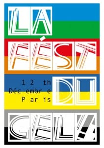
This poster was designed for an imaginary art festival in Paris. The design is very inspired by the modernism movement – it involves a lot of straight lines and bright, bold colours. Like I said before, the letters are big and bold, not subtle or hidden. Personally, I like the bottom part of the poster. the mix of black and grey give the “GEL!” a shine to it, making it stand out more. These two colours with the font could be used for the important parts of information.
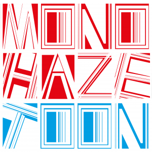
This is the design I made for an album cover. Again, another simple design where the font is the main focus of the piece. The cover only features two words: “monohaze” and “toon”. I tried to make this more obvious by changing the colour of the font for each word. However, after asking people, it was still hard to tell that there were two rather than three words. Considering “monohaze” is a made up word though created by combining two existing words, I’m not too bothered by this.
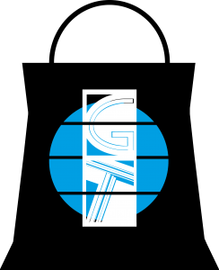
This is a shopping brand and logo for an imaginary store. Used in this style, I can see the font being some kind of very expensive and high quality fashion store; certainly one for women, rather than men. however, I do not think this is purely due to the font, I think the way the font is positioned and the the colour scheme I’ve use does play a major part in that feeling. 
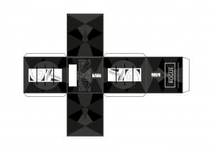
I decided togo further with the bag idea and made a box for the fragrance, which could potentially be made by the same made up brand. I also updated the logo a bit to suit the design a bit more.


Leave a comment