Reflection: Children’s Book

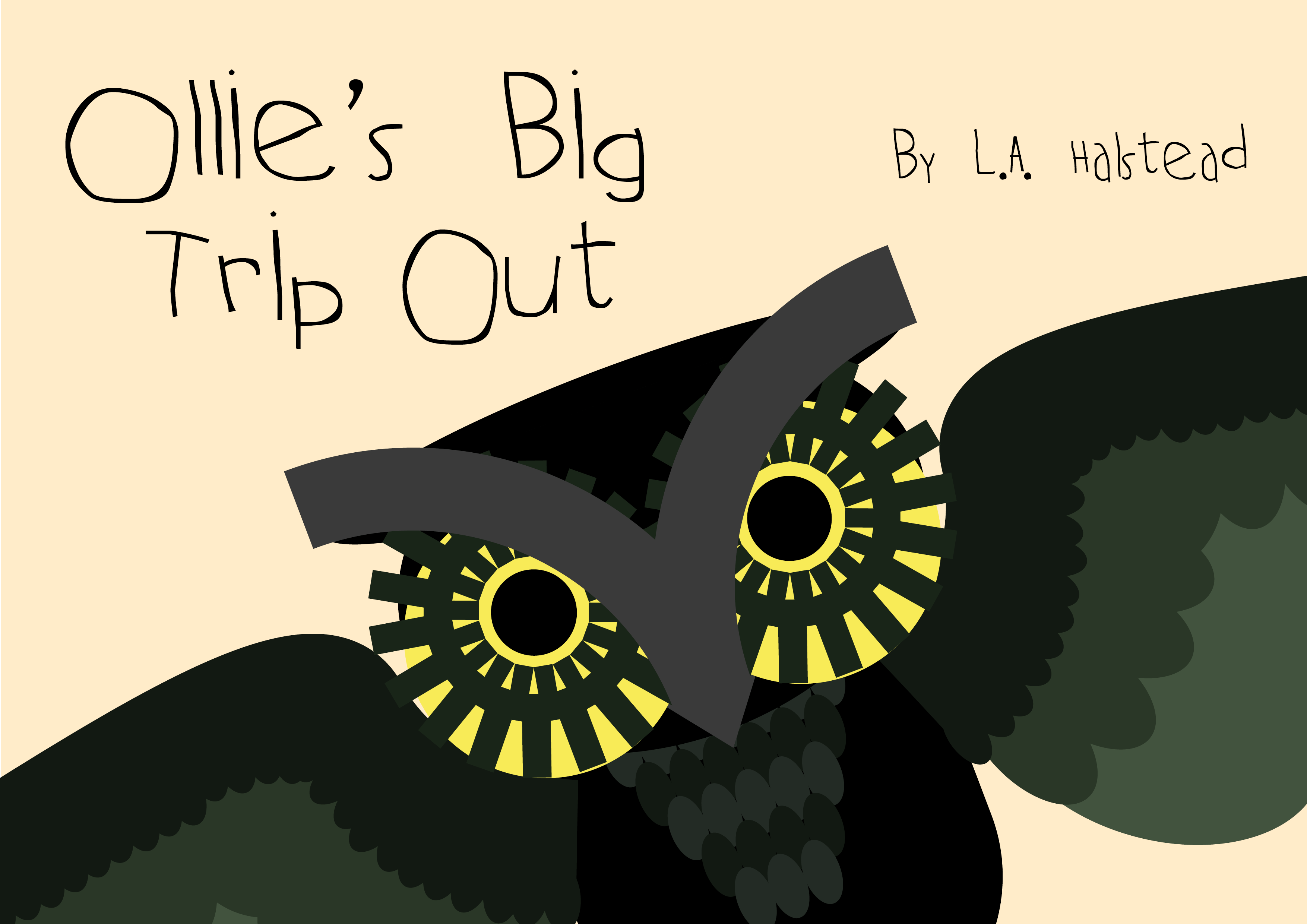
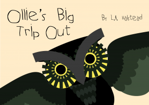
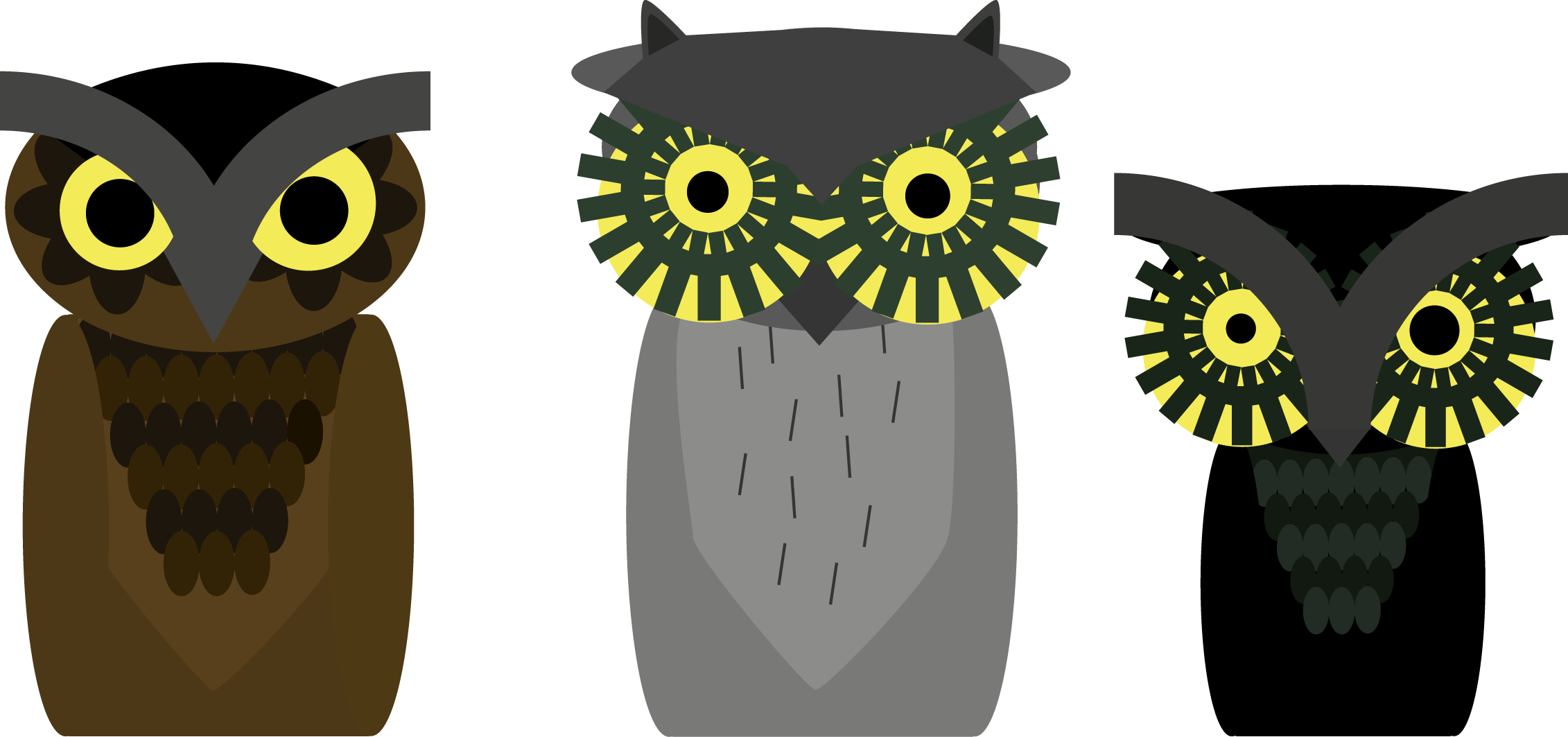
Overall, I would say this was a very strong project for me; although I struggled to think of what to do for and initial idea, I managed to bounce back with a complex but simple original design for a children’s book.

The aim of the book was to teach the children my book is aimed at (aged 5-8) about the ups and downs of drug use in a fun and friendly manner. While drugs can make you feel happy and god like, there can also be a downside to it and you must be responsible around drugs.

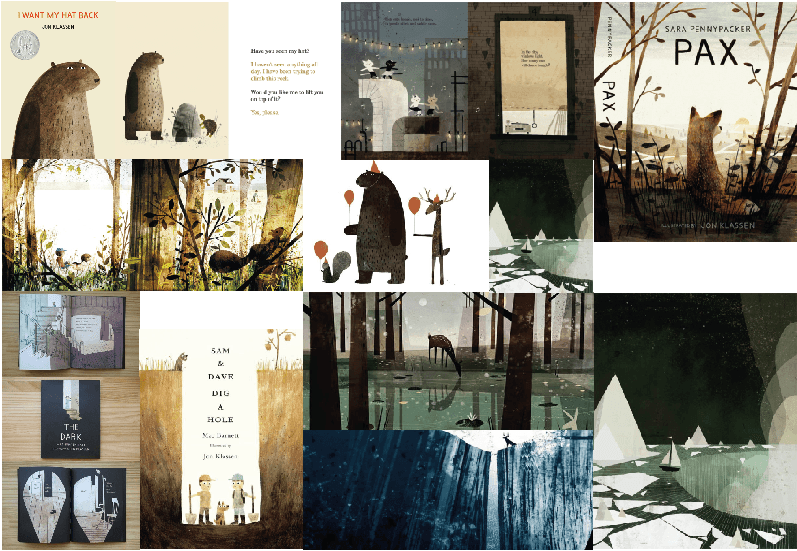
My strongest part I would easily say are the panels for the good part of the trip. my original intention was to produce an accurate depiction of a trip, however, I decided that it would be more fun and allow more creative freedom if I just based it off the idea of 60s hippie culture art, which did pay off in the end.

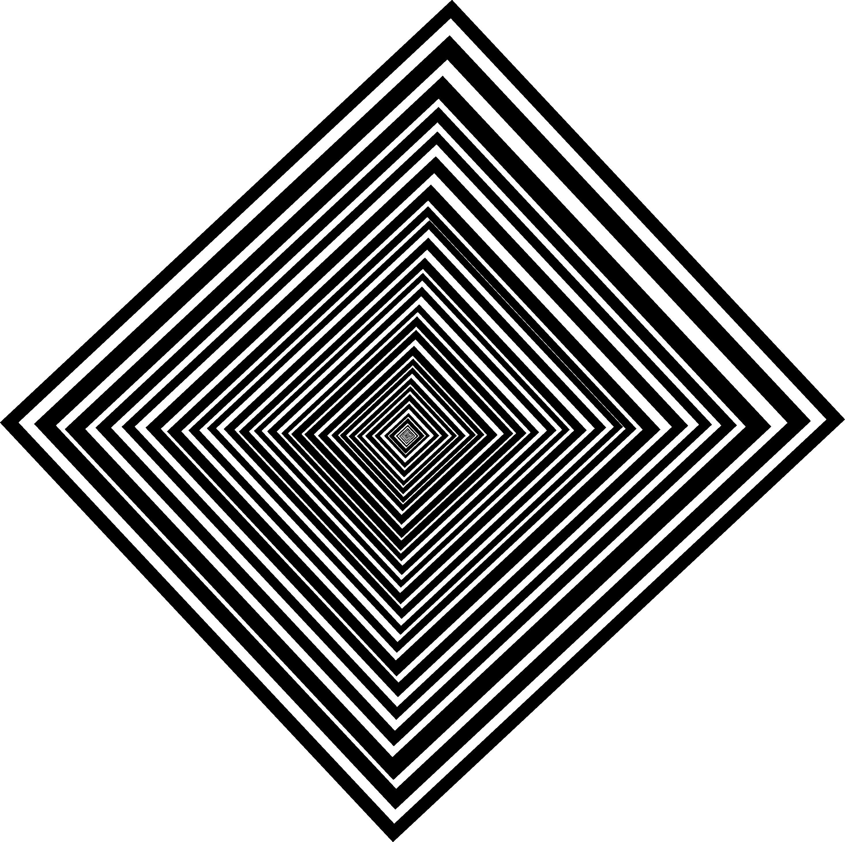
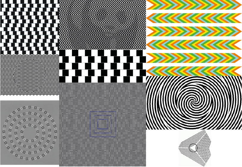
The weakest part of the book would probably be the part of the trip when it goes bad. I was not able to achieve quite what I wanted. I wanted to make the patterns hard to look for a period of time. Although I did somewhat achieve that, I feel that the deliberately messy aesthetic that I went for with the patterns may have hindered the effect a bit and if I had more time, I would probably experiment a bit more with these pages so I could get the exact effect I wanted.

In conclusion, this project has probably been my strongest this year; not only was I able to flex my artistic muscles but I was also able to combine it with one of my other passions; storytelling. Even though it was a basic story, I still had fun creating the story. This is one project I may come back to again in the future in my spare time.

Children’s book: The trips

After looking at my mood boards, I decided not to go with designs that were accurate to real trips – I decided that those were too boring and uninspiring for me. I decided to look at some 60s hippie culture to get inspired – I felt that I could go a lot further with my imagination if I did not limit myself to the real life accuracy. It also meant that I could make the designs more colourful and fun, so that the children reading it did not get as scared or freaked out.

Below are a few examples of the artwork I did for the book:

Ollie Is a God 2


I made the backgrounds bright and happy to show the emotions that Ollie Owl is feeling, while also making sure the colours were a bit grainy  so it kept with the overall aesthetic. I discovered the red lines by accident when I highlighted the background and found it added a nice effect on top of Ollie – making him seem more “god-like” and powerful. I decided to make it a part of the art as a result.

Ollie Does not like this 3

For when the trip goes bad, I deliberately made the background wonky and weird; I used a slight rectangle instead of a square and varied the thickness of each line. This was so I could make the background weird for people to look at and possibly hurt their eyes a little, so they can feel what Ollie Owl is feeling when his trip goes bad.

Children’s Book Covers

Coming into designing the cover I already knew several things; I wanted the cover to look fairly unsuspecting and innocent as well as keeping it simple. All I wanted on the cover was the title, my name and Ollie Owl. Below are a few concepts I came up with:

Covers5 Covers2 Covers4

These designs were good, however they did not capture my imagination like the final one.

Covers

This is the final cover design. I chose it due to it’s simplicity and some what subtle second meaning – it could be taken that a young child or drug addict wrote the title. Seeing as the book is about drugs, I thought it would be fitting to use this design.

Children’s book: Inspiration

Being inspired for art style was not too hard for this project; as soon as I saw the art of Jon Klassen – I instantly knew I wanted to go for that kind of art style. His work was simple but yet the characters had a certain complexity and elegance to them in the way they were drawn and coloured in. This simplicity often carried a comedic element to the story as well; with their often blank expressions somehow conveying a wide variety of emotions.

Here is a mood board that I developed around the work of Jon Klassen, I will refer to this for inspiration for both story and character design:

  Untitled-2

Once I designed my character (see character designs) and decided what my story was going to be about (Ollie Owl accidentally taking drugs and going on a trip), I decided to do some research in that area. Looking at accurate recreations of trips, I decided that it was too boring and that I wanted to exaggerate the look of the trip, so I decided to look at 60s hippie culture style art to get inspired. Here is a mood board that I developed from that research.

Untitled-4

For the part where the trip goes bad, I wanted to use some optical illusions to convey that – the hard it was for the reader to look at it, the better. Here is a mood board that I developed from that research.

Untitled-3

Children’s Book: Ollie’s Parents

Mummy Owl

Above is a concept for Ollies parents (with Ollie for size comparison) – a sub plot which I decided to remove from the final story. I decided to make them visually different to make it more interesting for the reader however, give them similarities to make it obvious they are his parents. For example, Ollie has his mum’s head dress and chest pattern, while he has his father’s eyes.

I ultimately decided to remove the sub plot as it would require too much time to work on – I would rather have a shorter story that was more finished than a longer one with more mistakes in. However, that did not mean I would remove them completely from the story – they can still be seen having an argument during Ollie’s good trip.