After looking at my mood boards, I decided not to go with designs that were accurate to real trips – I decided that those were too boring and uninspiring for me. I decided to look at some 60s hippie culture to get inspired – I felt that I could go a lot further with my imagination if I did not limit myself to the real life accuracy. It also meant that I could make the designs more colourful and fun, so that the children reading it did not get as scared or freaked out.
Below are a few examples of the artwork I did for the book:
I made the backgrounds bright and happy to show the emotions that Ollie Owl is feeling, while also making sure the colours were a bit grainy so it kept with the overall aesthetic. I discovered the red lines by accident when I highlighted the background and found it added a nice effect on top of Ollie – making him seem more “god-like” and powerful. I decided to make it a part of the art as a result.
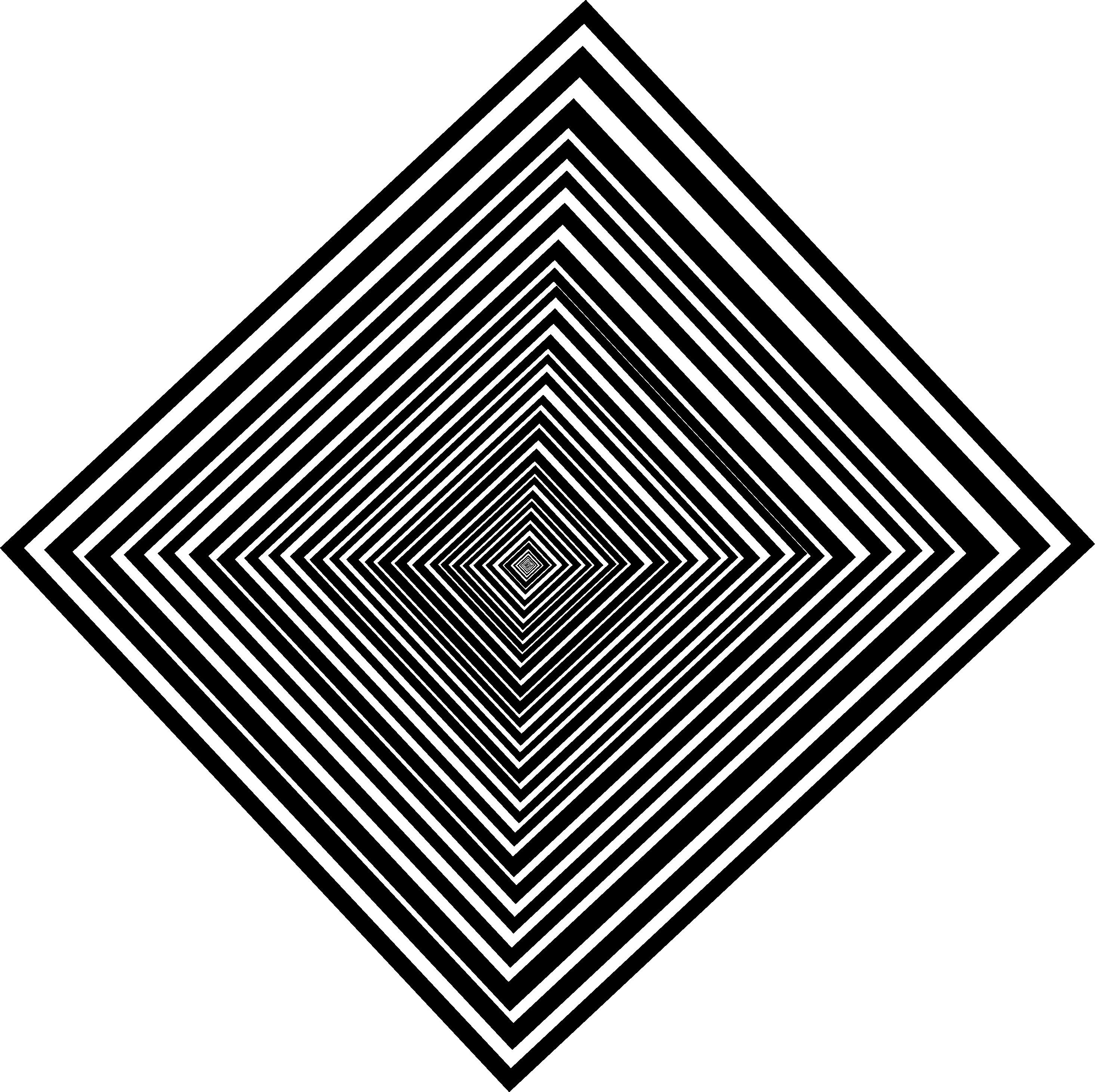
For when the trip goes bad, I deliberately made the background wonky and weird; I used a slight rectangle instead of a square and varied the thickness of each line. This was so I could make the background weird for people to look at and possibly hurt their eyes a little, so they can feel what Ollie Owl is feeling when his trip goes bad.
Leave a comment