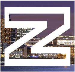
This time, I decided to experiment with the inside of letters, rather than the outside. Rather than using conventional colours, I thought I would make an out like of a letter and fill the inside with a photo or texture, etc.
Here, I decided to fill the letters with an image of the Liverpool skyline:

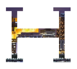
The A is my personal favourite, I actually took to the idea of letting the filler spill out from the letter. While the H does look good as it is, having the A’s background spill out makes the letter more unique and eye-catching, as well as adding more character to the letter. I will try and stick more with that style; with the points, etc.
Below is another experiment I did, using a texture rather than cityscape as the filler

I do not like this as much as I like the cityscape letters – they do not seem as unique as cityscape one. While close up it does look nice, from a distance i just looks like generic colour filling with nothing special about it. while I like this idea of the letters being negative, rather than just the generic form, I don’t like this very much.
I do however like the cities behind it and have decided to take that further for my final design.
Leave a comment