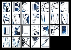
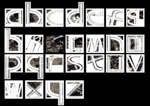
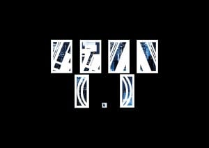
In all honesty, this hasn’t been the most inspiring of projects for me; it is very hard for me to really get my creative juices going when there are such huge limitations such as the fact that the shapes already exist. Despite this however, I have managed to produce a font that I am very proud of.
It was a tough font to do examples for; although I loved the end product, I found myself staring blackly at the screen a lot of the time, trying to come up with where I could use the font. Although I did come up with ideas in the end, I feel as though I should really have started to think about them back when I had a basic idea of how the font was going to look. Having said that, the font fits very well into the examples I did come up with and I feel that they would do very well in a sort of artsy type demographic.
If I had more time, I would probably work more on the punctuation and examples. Given enough time, I would have enjoyed creating a fully functional font – not just with punctuation, but also special characters, such as “ê” and “ü”.
In conclusion, I am very satisfied with my final design; there are areas I would like to have improved – however, I feel this is a very unique and bold font that can really stand out if use properly. However, it is a very specialist font that I feel would not be too useful outside of the artsy demographics. Other than this, there are not a whole lot of other problems I could think of with this font, and I am very proud of that.
– Luke Halstead


