The A2 Version
The A2 was the first version of the infographic I made. I did this as it seemed like the easiest and would be a good starting point for the others.
Below a design I came up for the A2 version of the infographic:
This version is what I came up with after all of my research. This is the version I showed at my presentation and ended up basing all the other sizes on.
This is the final design for the A2 version. After the presentation and receiving some feedback from my peers, I decided to review and redesign the the infographic a bit; the main thing I did was rearrange the text, so that the boarders between each section of the poster was more obvious.
The Desktop Version
Below is the first incarnation of the desktop version of my infographic:
Just like the phone version, this is simply the A2 version resized and rearranged. Although I was initially happy with this, I decided to redesign after realising how satisfied I was after re designing the phone version.
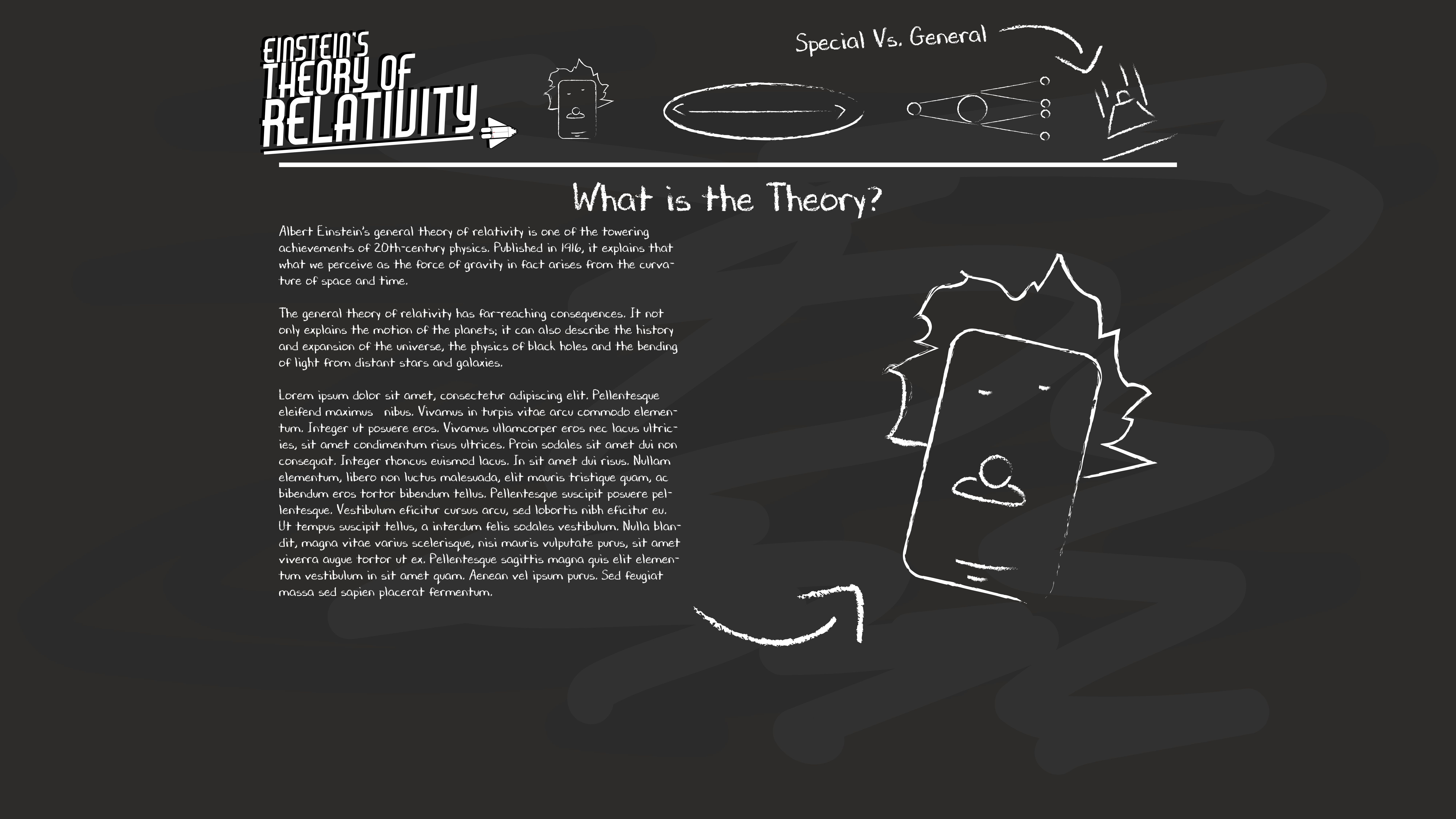
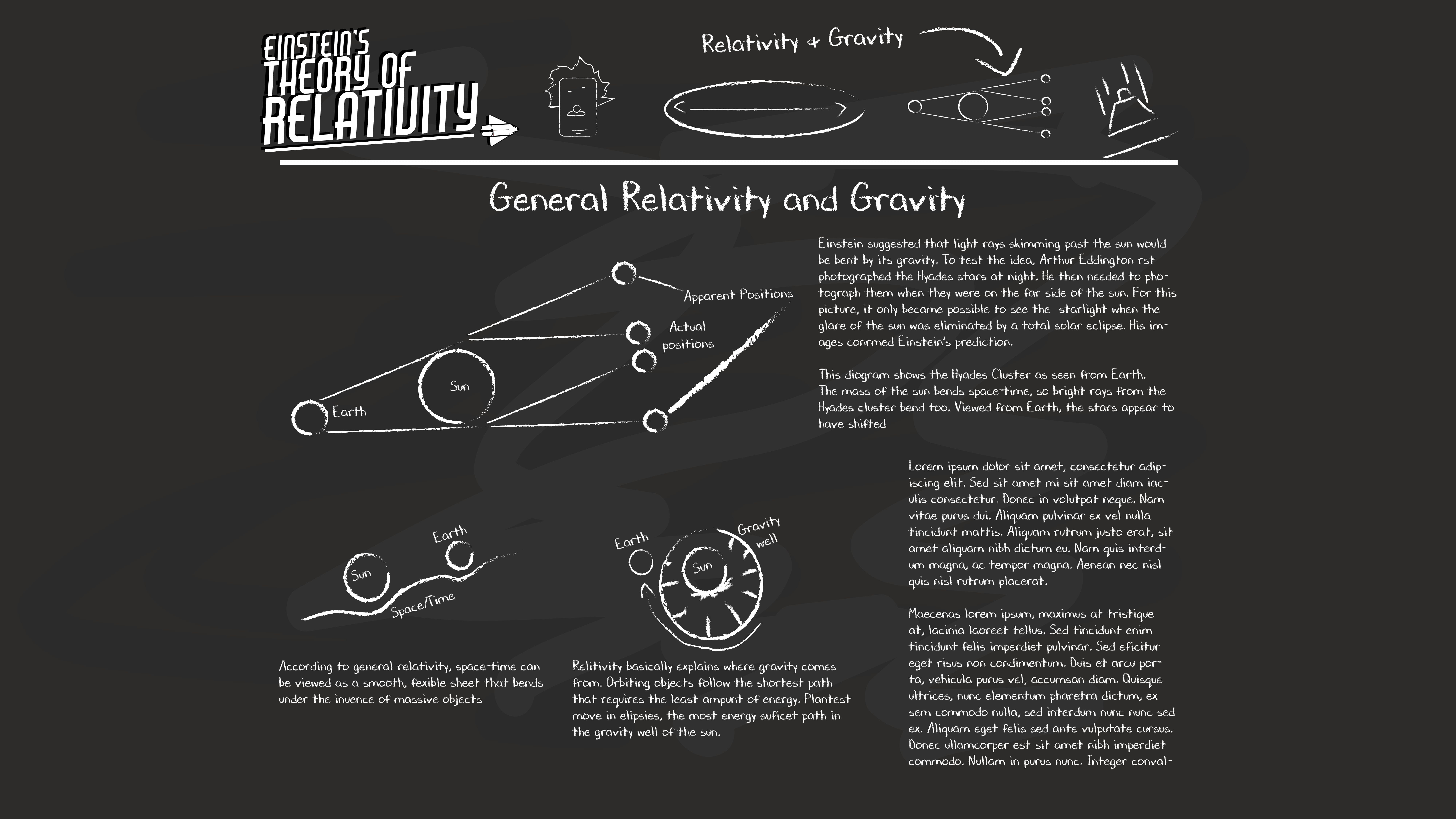
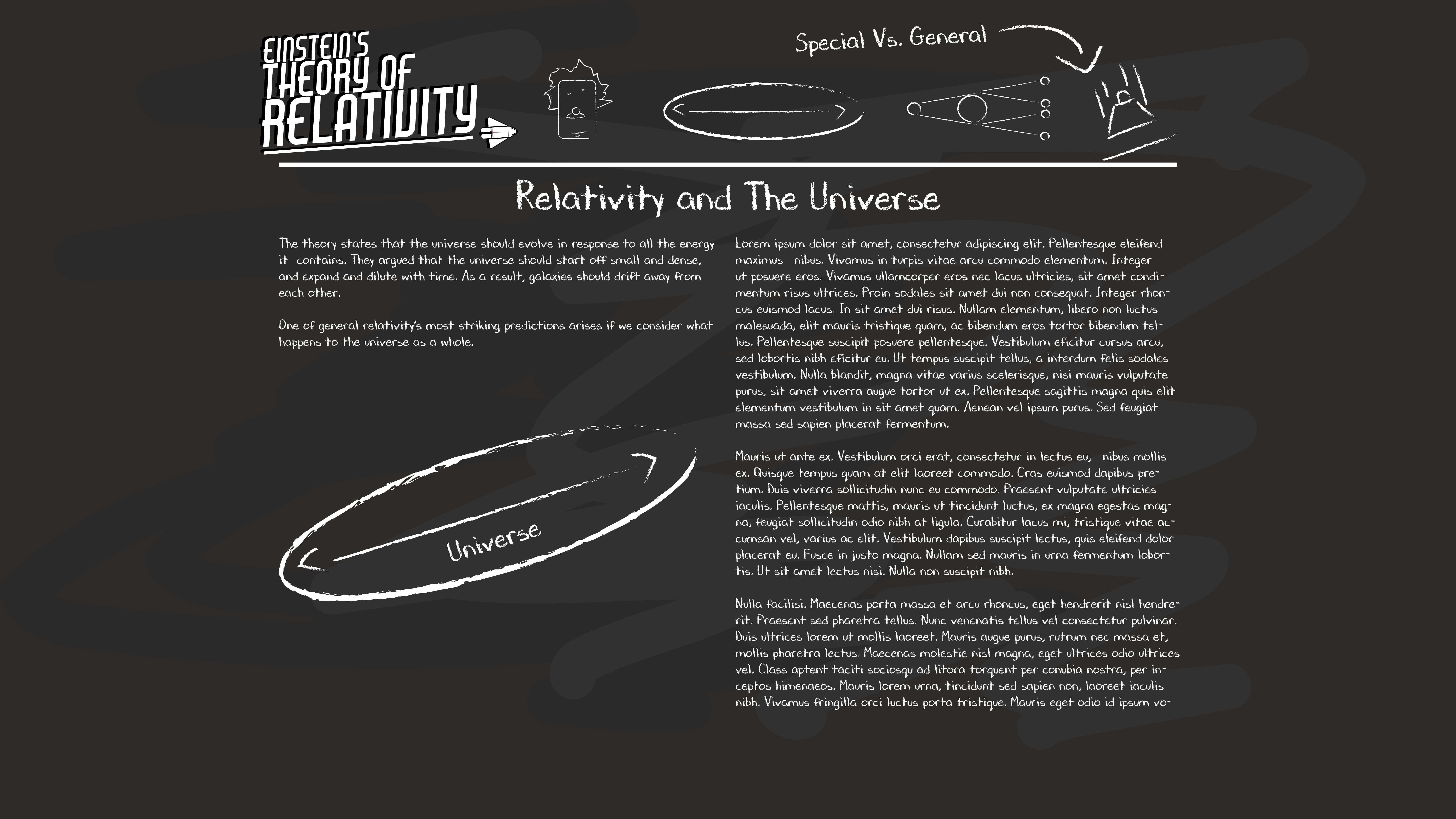
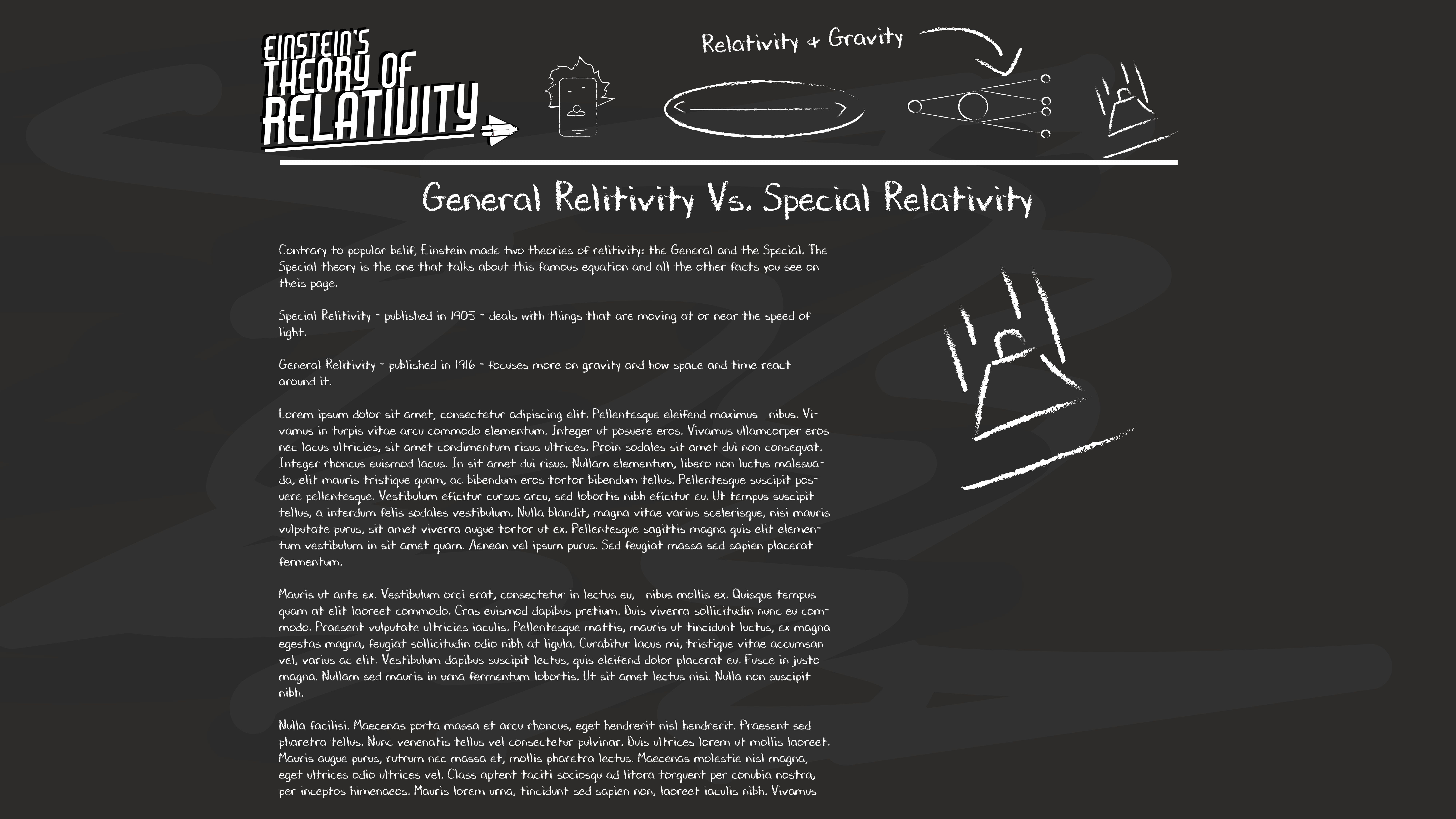
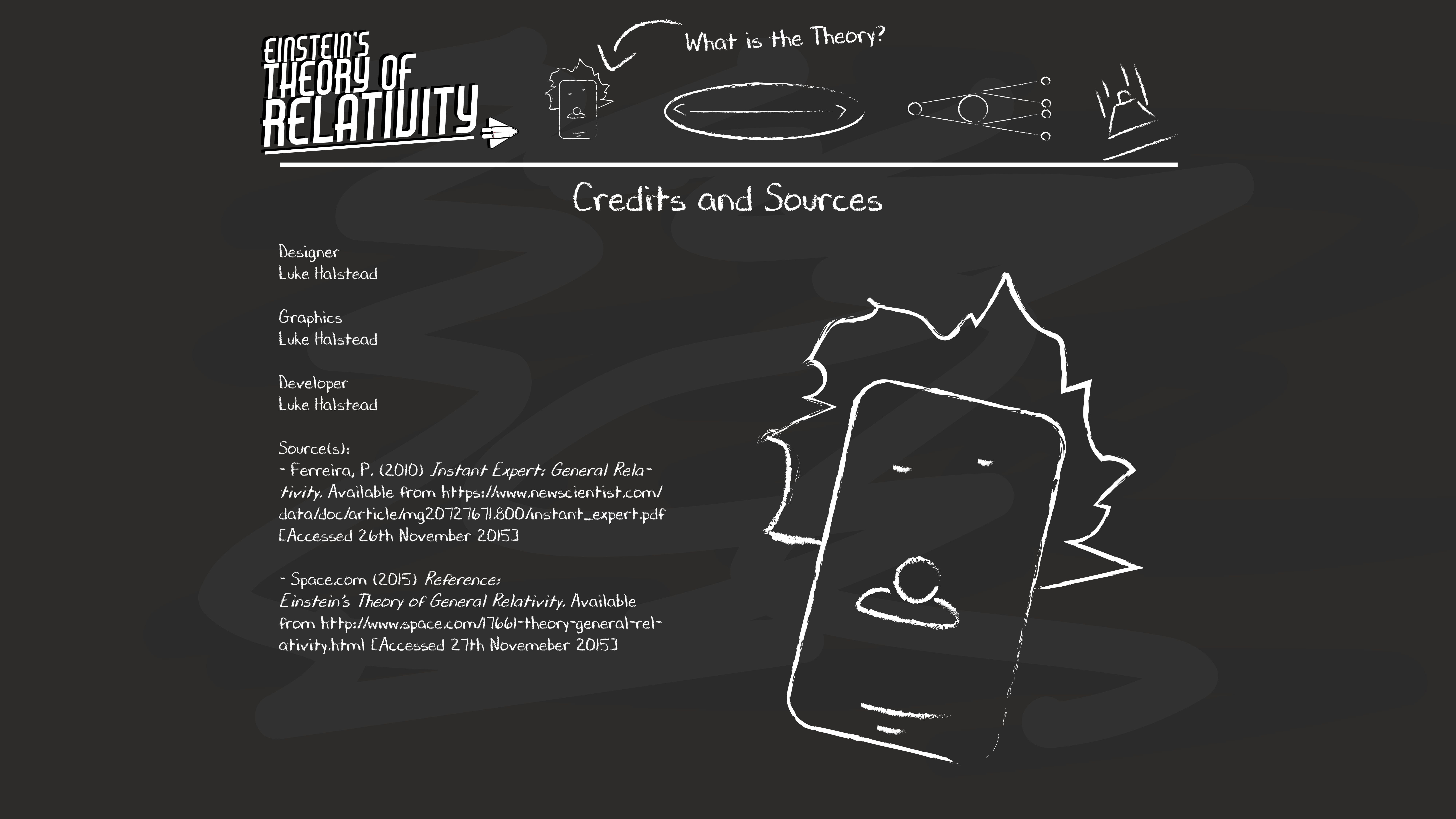
This is the final design for the desktop version. This is what I came up with based on what I saw and feedback from my peers. Following on from the A2 and mobile versions, the desktop version follows the same style of text and diagrams, as well as containing the same information (although it can hold more, shown by where I’ve used the Lorem Ipsum) all menu items – when the cursor is place over the icon – will display the name of the destination page, as well as slightly enlarging the icon. All menu icons are diagrams taken from the destination page. The “Einstein’s Theory of General Relativity” icon will take the user back to the homepage. Just like with the phone version, each page will focus on a particular subject. The home page is very simple; just the logo in the middle, with the menu items underneath. The user interacts with them in the exact same way as stated before. This page has an extra option on it though; a page that gives credit to those who developed the page, as well as the sources of information. Just like with the phone, I added some “board markings” to make the background a bit more interesting and more like an actual blackboard.
Leave a comment