After developing the A2 version, I moved onto the phone version. Here is what I came up with:
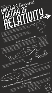
In this version, I had simply rearranged the A2 version, and had made the text smaller to fit the size. Although I was happy with it, after the presentation and seeing my peer’s design, I decided to do a complete overhaul of the design. This is what I came up with:
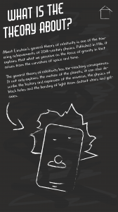
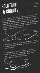
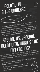
This is my final design for the phone version. One of the big criticisms of the infographic was the size of the text, so I decided to rather than cram it on one page, I decided to make it interactive. I will talk about each page in the order above.
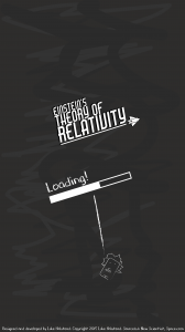
The first page is a loading page. As it loads, I plan to have the logo grow and shrink like it’s bouncing in and out from the background. The loading bar will also fill as it loads. This page will also contain the appropriate credits and sources at the bottom as show. I also added a textured background (that is meant to resemble rubbed out chalk on a blackboard) as I felt with this new design, the background look a bit too plain. I tried this background style with the other sizes of infographic, but this just made them look too cluttered. This page will also be used between transitions if need be and will drop down from the top and the drop off the screen.
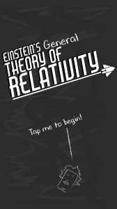
One the second page, when it is done loading, the title will grow big one last time and stay that size, maybe bobbing up and down a bit – but nothing more. The loading bar itself will the drop off screen and the word “loading” with transform into the phrase “tap me to begin!”. This bit will do the same action as the title on the previous screen. The user will then either tap the statement, the Einstein drawing or anywhere in-between to begin.
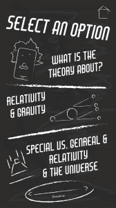
Once, tapped, the page will transition by dropping all the elements off the screen, and the elements for the contents will drop in from the top. Only the images will move on this page – so that it is not too distracting to the user. Even then, these will only do subtle bobs up and down in a small area.Once any of the contents options are tapped, it will do the same transition as between the “tap to begin” page and the contents page. There will also be a home button at the top (This will not move like the other images) – This will be on every page in the same place from now on. Once tapped on any page, it will do the same transition as between the “tap to begin” page and the contents page. The user will then be taken back to the “tap to begin” page.
The other pages contain the same information as the other infographic, just divided over three pages. The text on the phone version is actually larger than the text on the A2 version – as I found I actually had too much space. I also change the font of the subtitles – to the same font as the main title (Air American) – to make them stand out a bit more. I then got rid of the shadow in the background, so that they weren’t completely like the main title. As stated before, there is a home button to take the user to the “tap to begin” and the user can swipe left or right to access the different pages. There will be no animations on these pages, as it may distract the user too much from the text.
Leave a comment