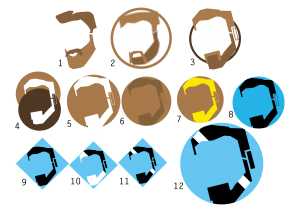
After looking some more at the design I had, I decided that it wasn’t good enough; some people were confused as to what it was, which could have an effect on business if employed. I decided to start from scratch again. Below is a timeline of how I got to the final design.
Numbered 1-12, this is the progress of the logo – 1 being the first design and 12 being the final. I wanted the logo to have a modern, isometric style to the way it was drawn. I chose the design to be in a circle, to give it a warm, friendly feel. At one point,I chose a square to show strength and stability, however, I decided that this wasn’t very relevant to a barbers and I instead used the circle. I swapped to blue and black from brown for two main reasons: to reinforce the friendly feel – and that these two colours helped add to the more modern look and feel I was looking for. The white streak on the beard makes it look brand new.
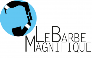
Here is the final logo, combined with the logo text. The positioning of each of these two elements in relation to each other may vary – depending on where the logo is being used.


Leave a comment