Using Video Games To Make Letters

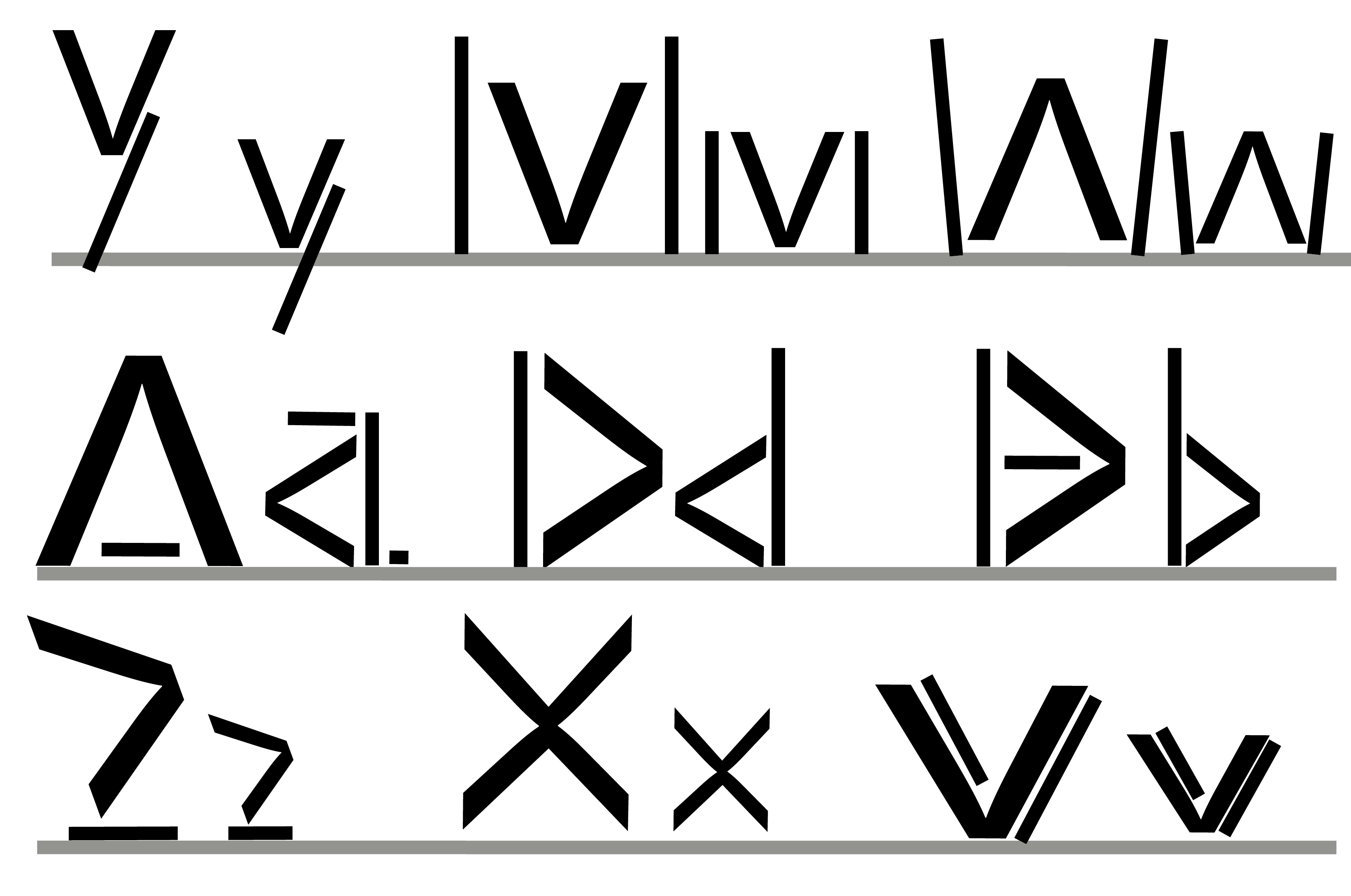
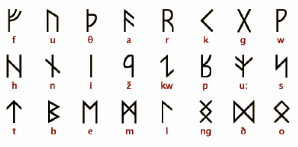
As I have been looking for new and unusual ways to create my font, I decided to go with something a lot less obvious – while a lot of people will use sketches and specialist programs to create their letters, I decided I want to take a break from that and try something more out of my comfort zone. So, I decided to combine two loves of mine together: design and video games.

In recent years, a lot more video games have started to add customisation and other creative features into their games. These include Garry’s Mod – which is good for creating machinimas, etc. – and Minecraft – which is good for building objects. Even traditionally non-creative games – such as Fallout have started to add creative elements into their games. I decided with all of these creative tools that at my finger tips, I wanted to take advantage of that. I chose Minecraft because while it is possible to use the other games mentioned – Minecraft has a much larger variety in textures and specifically designed for this kind of activity, rather than having it just add in later.

First off I tried just making A, P and L in their respective upper and lower cases in Minecraft:

MC 1 MC 2 MC 3


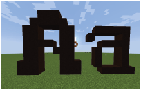
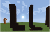
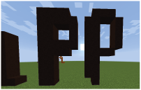
While they looked pretty good, I felt they were missing something – they looked way too simple. While that can work for a lot of fonts, I wanted to to create something more technical that stood out. So, I decided to take it a step further and try making the negative of these letters.

MC 4 MC 5 MC 6


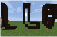
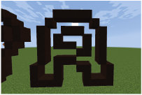
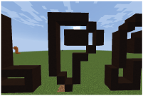
These I felt vastly improved the look of the letters, I especially liked the way the colours of the background filled in the negative space in the letters.

Initial Ideas – Gab’d

Here are some initial ideas for fonts that I had back at the start of the term (yes, I know I’ve posted stuff before this, but there were the first ideas I had). I called this font Gab’d – as these were the first letters I made. The idea of this one was to keep the letters inside the of a square no matter what. This was a lot harder than I expected, as you’ll see later. For now, below is a logo I made for the font by overlaying the first letters I made.

You can get an idea of the letters from this image, but here are some more closer up:

Gabd3 Gabd4 Gabd5

Looking at these letters, I felt that these were too simple for my tastes, so I decided to add a little more detail to them. I tried adding varying shades to them.

Gabd2 Gabd7 Gabd8

I also created a “q” and added the shading to it. the q was very hard to make, as the rule was it had to stick to the outline of the square as much as possible. Even like this, I am still not satisfied with the shape of it.

The shading did not make the letters look much better in my opinion. In fact, it does not look how I wanted it at all. Rather the darker parts looking shadows with a light shining on the letters from another angle. Although I could have improved it, I was starting to get bored with this idea. As well as that, making the “q” made me wonder how hard it would be to get the “p”s and lower case “g”. I decided that I needed a new idea and decided to leave this one.

Experimenting With Isometric Grids

Over the past few days, I’ve been looking at isometric grids as a possibility for my fonts.

This was quite a challenge for me, as Illustrator did not have an isometric function, so I had to make the grid myself. As well as that, the lines would not snap to the grid, so I had to be very cautious with drawing the lines, and they would be off at times.

Here are a few letters I made while messing around with fonts in Illustrator:

 Iso

Personally I prefer the e and P to all the others, but there is something slightly off putting about all of these letters. I feel it’s probably that they look very basic – like something someone with next to no experience with design would produce.

Overall, I would say that I am not satisfied with this at all; using isometric is a lot more tricky than it looks, and if you jump in blind, it can come up with some truly terrible results. While it was an interesting experience trying out isometrics, I don’t think this will be a style I will be taking on for my final design.

Below are a few fonts I found that inspired me:

Isomertic font 2

Isomertic font 1

Random Fonts

This section is for random designs that I did that I did not go into enough detail with to justify dedicating a post to.

Design 1: TACO

Untitled

This was a random font I created based off some design work I did last year when I was trying out lines with different thicknesses. While I do like it, I felt there was something missing – the design did not really look right and I could not think of a suitable place where it could be used. In the end I decided to scrap the idea and not continue with it.

Design 2: CO

CU

This CO was taken from the last two letters of the TACO. I made the lines thicker and it came out with this interesting look. I’m still not going to use this design, however, I feel that this is still a good design that I may use in the future.

Design 3: FW

FW

This was a design I made that consists entirely of triangles. However, I feel that these designs were not good quality – it is a bit hard to tell what the F is without looking at it properly, which is not great for a font design.

Nordic Rune Based Fonts

After seeing a classmate use nordic font types in his coursework, I decided to investigate them myself.

I enjoyed the simplicity and all off the jagged edges of the runes that found and decided to try playing around with that idea. My first idea was to take a “v” from the Helvetica font type and try and incorporate in some way into every letter I made.

Nordic type font thing

I made the letters Y, M, W, A, D, B, Z, X and V (in that order). The lower case is next to it’s respective upper case.

The biggest challenge for this was definitely doing the “v” – as I was already using a v, I had to come up with a way to make the v unique while still having it as a v. while it did not work out in the end, I’m not too fussed about this, as this was only a test for me – and I found this method does not work too well. However, this does not mean I am done with Nordic Runes.

Here is another font I made, experimenting with using more lines:

Nordic Letters 2


I made the letters R, F, P, H, Z and T (in that order). The letters below are lower case.

This time, I tried experimenting with more lines and angles as well as stick more closely to the standard rune style. I prefer these letters to my previous ones, as they feel less forced and distorted. Although it was interesting try in incorporate a particular shape into each letter, it was tough to do and really didn’t work with some letters. Here I was much more free to do what I wanted, and I feel it really improved the shapes.

My favourite part of this font in the use of multiple lines, rater than holes in the R and F, and I am going to try and take this style onto my final font design.


Here are a few existing examples of Nordic Rune I found that inspired me:

runer


gothic_runes