After seeing a classmate use nordic font types in his coursework, I decided to investigate them myself.
I enjoyed the simplicity and all off the jagged edges of the runes that found and decided to try playing around with that idea. My first idea was to take a “v” from the Helvetica font type and try and incorporate in some way into every letter I made.
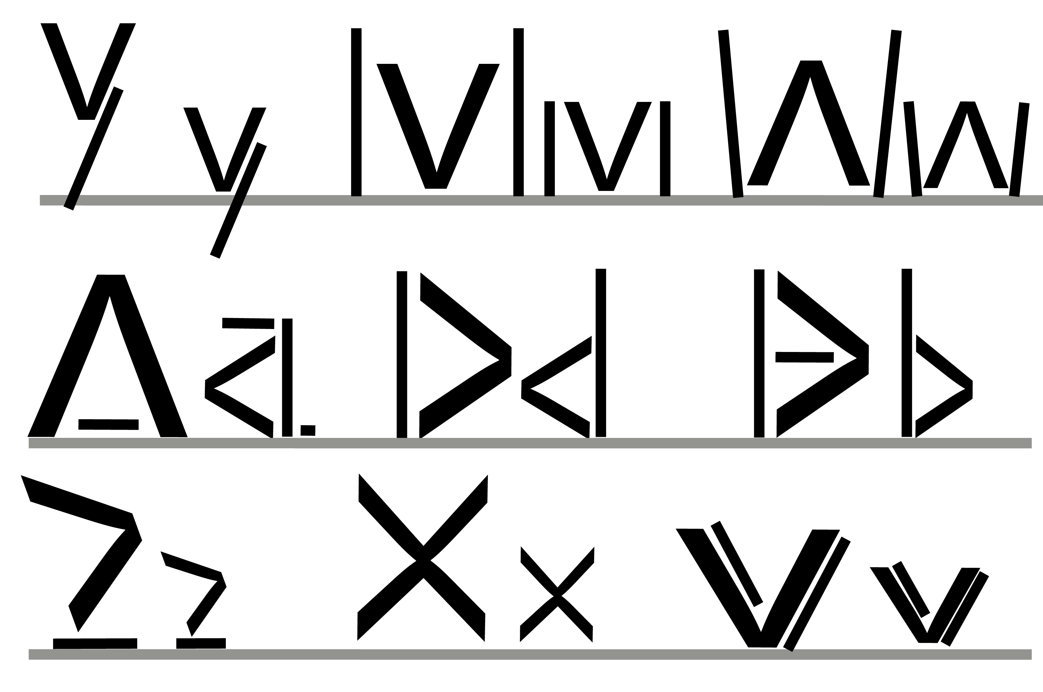
I made the letters Y, M, W, A, D, B, Z, X and V (in that order). The lower case is next to it’s respective upper case.
The biggest challenge for this was definitely doing the “v” – as I was already using a v, I had to come up with a way to make the v unique while still having it as a v. while it did not work out in the end, I’m not too fussed about this, as this was only a test for me – and I found this method does not work too well. However, this does not mean I am done with Nordic Runes.
Here is another font I made, experimenting with using more lines:

I made the letters R, F, P, H, Z and T (in that order). The letters below are lower case.
This time, I tried experimenting with more lines and angles as well as stick more closely to the standard rune style. I prefer these letters to my previous ones, as they feel less forced and distorted. Although it was interesting try in incorporate a particular shape into each letter, it was tough to do and really didn’t work with some letters. Here I was much more free to do what I wanted, and I feel it really improved the shapes.
My favourite part of this font in the use of multiple lines, rater than holes in the R and F, and I am going to try and take this style onto my final font design.
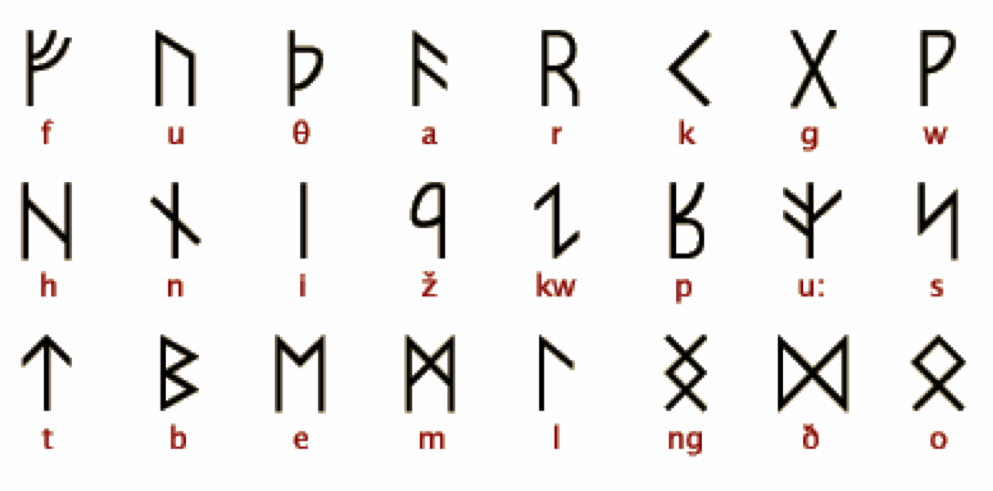
Here are a few existing examples of Nordic Rune I found that inspired me:

Leave a comment