Initial Logo Designs

Designing the logo was tough at first; coming up with a design that is modern, stands out and shows people what the company does in one simple image is tough.

The design I eventually came up stemmed from this image that I saw when browsing online for inspiration:

corporate-identity-design-package-20

More specifically, it was the red and blue isometric style lines that inspired me. I immediately got on Illustrator and started sketching up ideas.

Logo Progression

Above is the design progression of the logo; 1 being the first stage of design, and 8 being the last.

1) This is what I came up at first, as it was a barbers specializing in facial hair, I wanted to base the design off that, and what better way to do that than to do a beard?

2) While I like the first design, it looked off; it didn’t look obviously like a beard, but rather a logo for some kind of IT/game development company. I decided to add a little more depth and connect both sides of the beard and mustache.

3) As it was a barbers, I decided to add some hair on top – this also made it even more obvious that the logo is meant to be a beard.

4) I changed the colour of the top hair to create a slight 3D effect to the logo. I also fiddled around with the positioning a bit.

5) In the the end, I decided to keep the hair in the normal place.

6) I tried adding some glasses to the design to give it more of a face and character. Ultimately, I decided to scrap this, as I wasn’t satisfied with the aesthetics of the glasses.

7) I fiddled around with the proportions of the logo, making it slightly thinner and taller. I also raised the hairline of the logo and the thickness of the joining part of the beard and mustache halves.

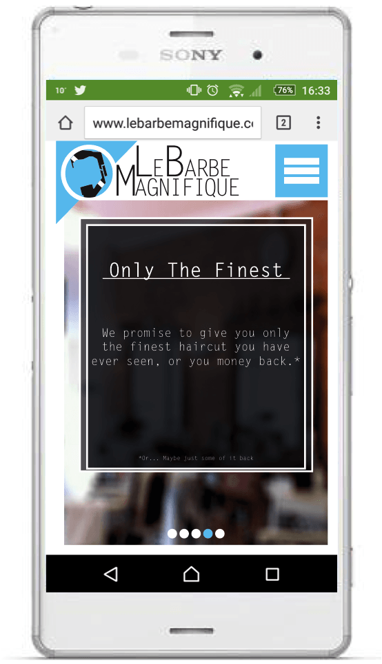
8) The final design: I decided to shrink it a bit and made the proportions of the mustache and beard when they cross each other’s paths. It’s a very subtle change, but it really helps with the aesthetic; creating a slight 3D effect on the logo.

Logo Beard

This was the beard design I came up for the logo. However, it is no longer the final designer.

Logo Research

The logo is probably the hardest part of designing a corporate identity; once you have the logo, everything else tends to flow pretty easily once you have the logo, but it’s finding that design that can really stump people, myself included.

Here are some mood boards that I made to inspire me and help me come up with a design:

Mood Board Mood Board2Mood Board v43

 I am looking to have a sleek, modern design for my logo. A lot of companies seem to be going for a “flatter” look when it comes to corporate identity; less shadows, more 2D and using a lot more curves in their logos, etc. As I am aiming to give Le Barbe Magnifique a more trendy and updated look, I will be taking on this style of design for my own work. As you can see above, I have looked at a lot of logos that follow this trend.

I also looked more into the technical aspects of creating a log too; for example, I looked at the shapes that could be used and the kinds of emotions that we associate with them to try and figure out which ones I should use. I noted some of my findings on an InDesign document:

Shapes and Colours

On top of that, I looked at some colours and noted down some key words associated with them:

Shapes and Colours2

Doing this would help with choosing the colour scheme and shapes I would use for designing the logo. It would help with the kind of mental message that I want to send with it; I want the company to seem warm and approachable as well as being competent and seeming like they would do a good job with your hair.

Le Barbe Magnifique Website (Mobile)

As with most good websites, there is a mobile version.

This is the final version of the mobile site.

Mobile WebsiteMobile Website2Mobile Website3Mobile Website4Mobile Website5

This is the menu bar that appears when you tap the menu button. The page the user is currently on will be shown by an extended bar.

Mobile Website6

This is how the site will appear on a mobile phone. The website will automatically compress and crop to fit the phone screen as closely as possible.

Website Mobile