The logo is probably the hardest part of designing a corporate identity; once you have the logo, everything else tends to flow pretty easily once you have the logo, but it’s finding that design that can really stump people, myself included.
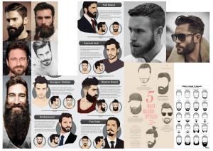
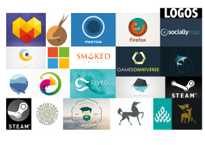
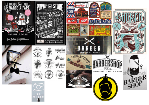
Here are some mood boards that I made to inspire me and help me come up with a design:
I am looking to have a sleek, modern design for my logo. A lot of companies seem to be going for a “flatter” look when it comes to corporate identity; less shadows, more 2D and using a lot more curves in their logos, etc. As I am aiming to give Le Barbe Magnifique a more trendy and updated look, I will be taking on this style of design for my own work. As you can see above, I have looked at a lot of logos that follow this trend.
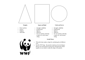
I also looked more into the technical aspects of creating a log too; for example, I looked at the shapes that could be used and the kinds of emotions that we associate with them to try and figure out which ones I should use. I noted some of my findings on an InDesign document:
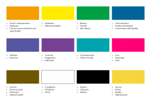
On top of that, I looked at some colours and noted down some key words associated with them:
Doing this would help with choosing the colour scheme and shapes I would use for designing the logo. It would help with the kind of mental message that I want to send with it; I want the company to seem warm and approachable as well as being competent and seeming like they would do a good job with your hair.
Leave a comment