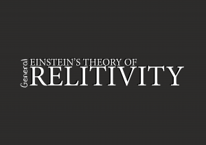
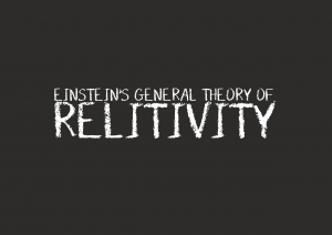
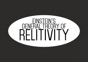
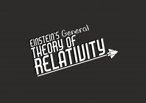
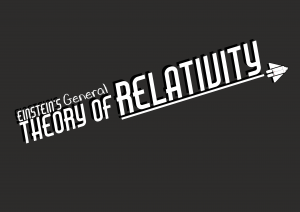
The design for the title was pretty spontaneous, but not instant. I started off by doing these two designs initially for the test infographics
I knew after making these that these would not do for the final design; the looked very boring some looked too academic. Although the poster is designed for students at a high level, I didn’t want it to look too boring, and the title was one way to make the poster a bit more interesting and fun.
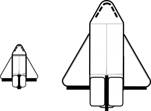
The design for the title came about after I made this space shuttle design randomly while messing about with ides for a design:
I couldn’t really find a place to incorporate the shuttle into the other aspects of the infographic, so i tried putting it into the title. With a combination of this shuttle and being inspired by older film title designs, I came up with these two designs:
They are both fun, fit in with the idea relativity – with a kind of space aesthetic – and fit well with the colour scheme. Although often can be controversial – I like the shadow effect on this, as it adds a subtle 3D effect to the title, making it look a little more alive. This is a style of title that I think works well and I intend on putting these on my final designs.
