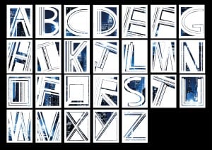
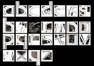
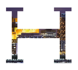
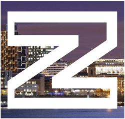
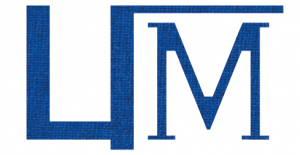
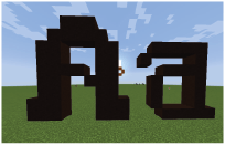
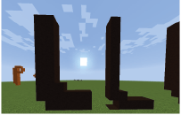
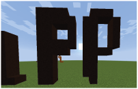
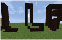
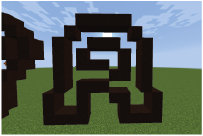
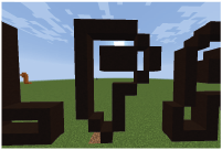
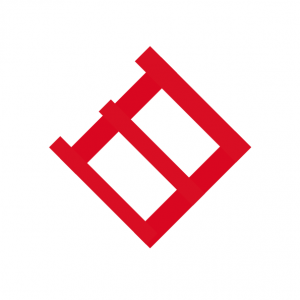
Below is the final font I developed based on all the research I have done:
I have dubbed the font “Barcode” – after a friend said it reminded him of barcodes.
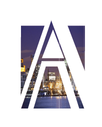
The cityscape in the back is not part of the design; this is just to show how the letter can look. The space is meant to be negative and can be filled in with anything image the user desires; whether it’s cityscapes, materials, plants, or just standard bold colours.
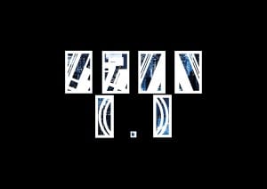
I also made some pieces of punctuation to fit with the font. These include an exclamation mark, question mark, full stop, a forward and back slash and an open and closed bracket as shown below.
In conclusion, I am very proud of the final product. There is not much improvement I feel I could do with these fonts; it’s not often that I work on something for as long as I did with these and I don’t become sick of the sight of it at the end. My personal favourite is the capital H, I feel like like it has a lot of detail and character, while still being obviously a H and not being too hard on the eyes.
