Children’s book: Inspiration

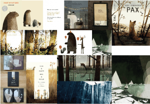
Being inspired for art style was not too hard for this project; as soon as I saw the art of Jon Klassen – I instantly knew I wanted to go for that kind of art style. His work was simple but yet the characters had a certain complexity and elegance to them in the way they were drawn and coloured in. This simplicity often carried a comedic element to the story as well; with their often blank expressions somehow conveying a wide variety of emotions.

Here is a mood board that I developed around the work of Jon Klassen, I will refer to this for inspiration for both story and character design:

  Untitled-2

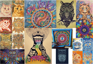
Once I designed my character (see character designs) and decided what my story was going to be about (Ollie Owl accidentally taking drugs and going on a trip), I decided to do some research in that area. Looking at accurate recreations of trips, I decided that it was too boring and that I wanted to exaggerate the look of the trip, so I decided to look at 60s hippie culture style art to get inspired. Here is a mood board that I developed from that research.

Untitled-4

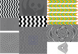
For the part where the trip goes bad, I wanted to use some optical illusions to convey that – the hard it was for the reader to look at it, the better. Here is a mood board that I developed from that research.
Untitled-3

Children’s Book: Ollie’s Parents

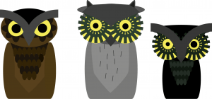
Mummy Owl

Above is a concept for Ollies parents (with Ollie for size comparison) – a sub plot which I decided to remove from the final story. I decided to make them visually different to make it more interesting for the reader however, give them similarities to make it obvious they are his parents. For example, Ollie has his mum’s head dress and chest pattern, while he has his father’s eyes.

I ultimately decided to remove the sub plot as it would require too much time to work on – I would rather have a shorter story that was more finished than a longer one with more mistakes in. However, that did not mean I would remove them completely from the story – they can still be seen having an argument during Ollie’s good trip.

Children’s Book: The Main Character

Below is the first concept design of the main character that I chose to run with – Ollie Owl.

Ollie

There have been a few – though not many – changes to his final design since this concept. For example, I got rid of the textures, as I felt they made him look a bit off as well as making the software I was using lag when doing simple actions such as moving him or copying and pasting him. Due to issues with the colouring, I also changed the colour of his beak and head dress so that they would match and seem to blend in with each other.

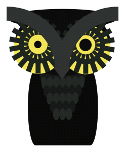
Ollie 2

This is the final design I came up with for Ollie. I have added wings to him, however, he will have the same stance as the first design when they are tucked away. I also added feet, which will be visible when the wings are tucked away too. I gave Ollie a slight green tinge over all as I wanted him to look unique and exotic – a style that quite literally matches his eyes.

Children’s Book: Character Design

I decided to come up with a main character before the story, as I thought that the design of the character would help me decide what kind of story I would write. I knew I wanted the story to have some sort of dark plot, but I didn’t know where to start. Below are some of the designs of character I came up with in the very early stages.

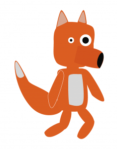
Red Is Hungry

This character design is called Red and was made for a story I ended up calling “Red Is Hungry” – a story where Red would go around looking for food and eventually dies of starvation as no one would give him any as he often stole from them in the past.

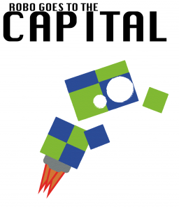
Robo Goes to the Capital

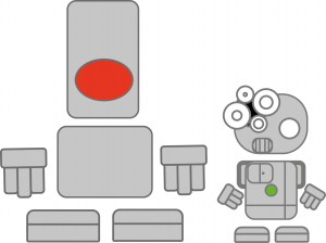
This design almost became the one I settled with, I even when as far as to come up with a title design. It follows Robo – an odd robot made from fabric – as he went around his communist capital and learned about his “glorious” state of Varster, oblivious to all the cruelty and hardships that were actually going on around him. I even ended up doing concepts for two more characters (below), which may have been thugs that could attempt to mug him.

Robots2

Le Barbe Magnifique Website (Mobile)

As with most good websites, there is a mobile version.

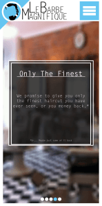
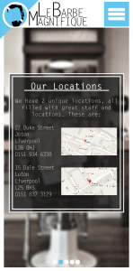
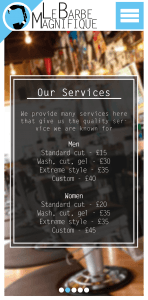
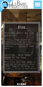
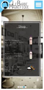
This is the final version of the mobile site.

Mobile WebsiteMobile Website2Mobile Website3Mobile Website4Mobile Website5

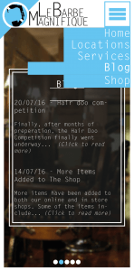
This is the menu bar that appears when you tap the menu button. The page the user is currently on will be shown by an extended bar.

Mobile Website6

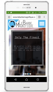
This is how the site will appear on a mobile phone. The website will automatically compress and crop to fit the phone screen as closely as possible.

Website Mobile