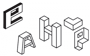
Over the past few days, I’ve been looking at isometric grids as a possibility for my fonts.
This was quite a challenge for me, as Illustrator did not have an isometric function, so I had to make the grid myself. As well as that, the lines would not snap to the grid, so I had to be very cautious with drawing the lines, and they would be off at times.
Here are a few letters I made while messing around with fonts in Illustrator:
Personally I prefer the e and P to all the others, but there is something slightly off putting about all of these letters. I feel it’s probably that they look very basic – like something someone with next to no experience with design would produce.
Overall, I would say that I am not satisfied with this at all; using isometric is a lot more tricky than it looks, and if you jump in blind, it can come up with some truly terrible results. While it was an interesting experience trying out isometrics, I don’t think this will be a style I will be taking on for my final design.
Below are a few fonts I found that inspired me:
